Author: Faiz RK

  • Sweatshirt for Men in USA: 12 Easy Outfit Ideas

    Sweatshirt for Men in USA: 12 Easy Outfit Ideas

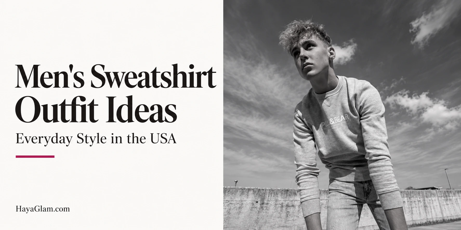
    Finding a sweatshirt for men in USA stores is easy; turning it into an outfit you enjoy wearing takes a little more thought. A sweatshirt can work for a weekend coffee run, a casual campus day, a relaxed office, or a long journey. The useful question is not which look everyone else wears, but which fit, fabric, and combination suit your routine and your daily needs.

    These men’s sweatshirt outfit ideas focus on adaptable styling rather than expensive shopping lists. Start with clothes you own, consider the weather and occasion, and use one detail to make the combination feel intentional. You do not need a different sweatshirt for every plan, and a familiar piece can become more versatile when you change its layers, pants, or shoes.

    Choose the Fit Before the Outfit

    A regular-fit sweatshirt is a flexible starting point. It should give you enough room to move without making every layer feel bulky. Check the shoulder placement, sleeve length, neckline, and hem together. The right fit depends on the intended design, so an intentionally dropped shoulder is not automatically a sizing mistake.

    For a relaxed silhouette, balance the sweatshirt with pants that have a clear shape. For a closer fit, make sure you can sit comfortably and raise your arms. Compare garment measurements with a sweatshirt you already like instead of relying only on small, medium, or large labels, which vary between brands.

    Think about the layer underneath and any jacket above it. A sweatshirt that feels comfortable alone may be awkward under a close-fitting coat. Try the complete combination when possible, particularly if you are buying the piece for colder weather or travel.

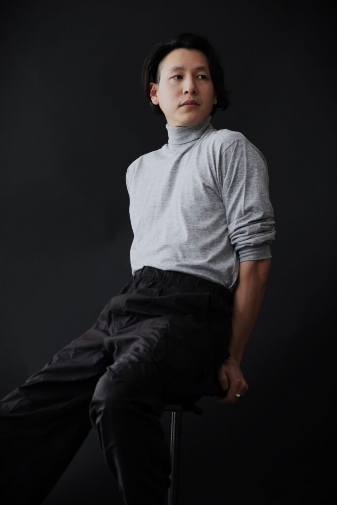
    Understand Fabric and Weight

    Read the fiber label rather than assuming every sweatshirt feels alike. Cotton, cotton blends, and synthetic blends can have different textures, care requirements, and finishes. Check the product description for the inside surface too: a brushed interior and a loopback interior offer different tactile experiences.

    Weight is another practical consideration. A substantial sweatshirt can feel satisfying on a cool evening, while a lighter version may be easier to layer or pack. Thickness alone does not prove quality. Examine stitching, the neckline, cuffs, and whether the fabric feels comfortable against the layers you usually wear.

    Consider how you will wash it before buying. A garment that requires care you rarely have time for may not become a useful everyday item. Compare the actual construction and instructions instead of treating premium, heavyweight, or essential as guarantees of performance.

    Twelve Men’s Sweatshirt Outfit Ideas

    Back view of a gray graphic sweatshirt styled for the street
    Photo: Pexels

    Gray Crewneck With Dark Jeans

    A gray crewneck and dark jeans make an uncomplicated starting outfit. Add understated sneakers or casual boots, then decide whether you want a visible T-shirt neckline. Keep that detail neat rather than letting several layers gather around the collar.

    For more denim combinations, explore our dark denim outfit guide. Adjust the jeans’ shape to your preferred proportions; straight and relaxed cuts can both work. The aim is a balanced combination, not a rule that every man must wear the same silhouette.

    Navy Sweatshirt With Chinos

    Navy with tan, stone, or olive chinos offers a calmer alternative to denim. Try plain sneakers for a casual finish or loafers if they suit the setting. Check how the sweatshirt hem sits above the waistband.

    This combination can work for an informal lunch or a relaxed office when its dress code allows it. A clean neckline and well-kept shoes help the outfit feel considered. Do not assume that calling it smart casual makes it suitable for every workplace.

    Black Sweatshirt With Black Trousers

    A black sweatshirt with black pants creates a simple tonal outfit. Different textures can give it depth without needing a strong color contrast. You might choose denim, casual tailored pants, or comfortable joggers according to the occasion.

    Look at the shades together in daylight. Slightly different blacks are not a problem, but you should like the overall effect. Use a simple shoe and let the proportions carry the outfit rather than adding accessories solely because the palette is restrained.
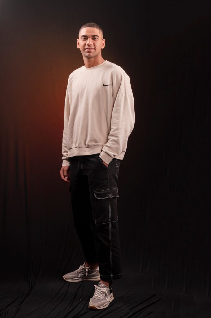

    White or Cream Sweatshirt With Blue Denim

    A light sweatshirt and blue jeans create a clear contrast that works for an easy daytime look. Keep the shoes simple and consider a darker jacket when you want another layer. Cream and bright white offer different impressions, so choose the shade you enjoy wearing.

    Check the fabric’s opacity and how easily its care instructions fit your routine. A pale color can be practical, but it is worth thinking about travel, food, and frequent use before making it your only everyday sweatshirt.

    Sweatshirt Under a Denim Jacket

    A sweatshirt under a denim jacket gives familiar pieces a different role. Choose a jacket with enough room through the sleeves, then check that the layers move comfortably together. A thinner sweatshirt may be easier to accommodate.

    Try contrasting the jacket and pants so the outfit feels deliberate. You can also wear similar denim shades if you like that effect. There is no need to avoid denim combinations automatically; assess the actual colors, fit, and occasion.
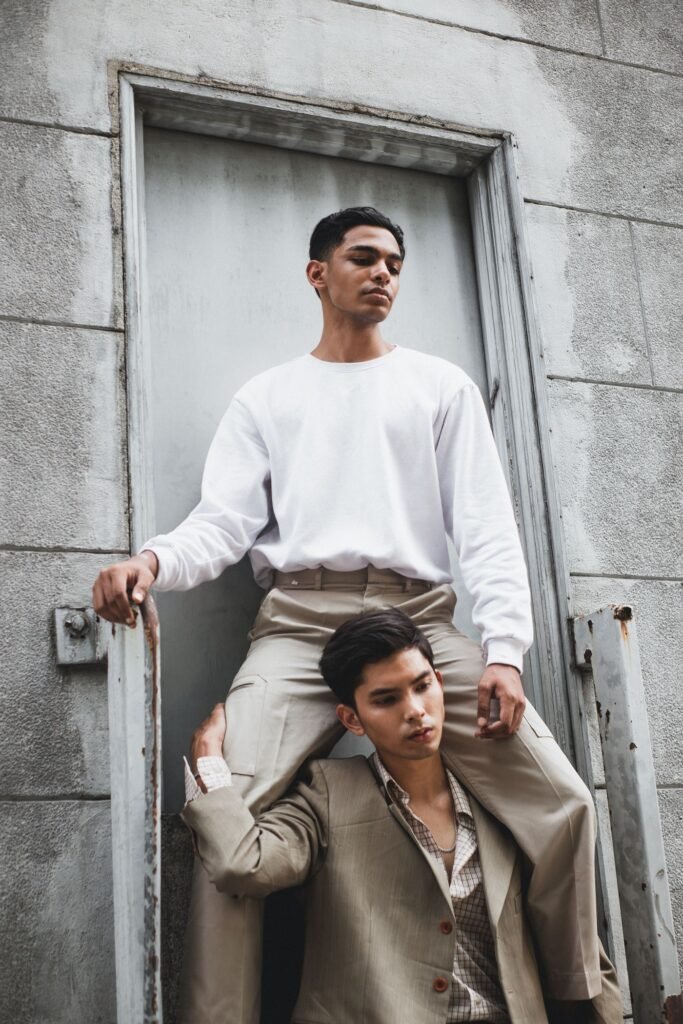

    Crewneck Under a Casual Blazer

    A plain crewneck can sit beneath a relaxed blazer for an informal setting. Start with a relatively simple neckline and avoid excessive bulk through the arms. Casual pants and clean shoes can finish the combination without making it feel like a mismatched suit.

    This is a styling option rather than a replacement for formal clothing. Check the invitation or workplace expectations first. If you spend the evening adjusting the layers, choose a roomier jacket or a different outfit.

    Sweatshirt With Cargo Trousers

    Cargo pants bring more visible structure through pockets and seams. Pair them with a comparatively simple sweatshirt when you want a balanced streetwear outfit. Consider how the trouser width works with the sweatshirt’s volume.

    An oversized top and wide pants can work together, but try the complete silhouette rather than increasing every item’s size independently. A cap or compact bag can be useful additions when they serve your plans. You do not need multiple accessories to make the outfit convincing.

    Matching Sweatshirt and Joggers

    A matching sweatshirt and joggers offer an easy coordinated option for relaxed days and travel. Fit still matters: check the waistband, cuffs, and sweatshirt length rather than assuming a matching set will look balanced automatically.

    Wear the pieces separately as well. The sweatshirt might work with jeans, while the joggers could pair with a different top. That flexibility makes the set more useful than an outfit reserved for one exact combination.


    Sweatshirt With Shorts on a Cool Evening

    A sweatshirt and shorts can be useful when the evening feels cooler than the day. Try a regular or relaxed top with shorts that let you sit and walk comfortably. Trainers or other suitable casual footwear keep the combination straightforward.

    This can suit a coastal visit, a campsite gathering, or an informal weekend. Check the forecast rather than assuming shorts will remain comfortable after sunset. Carry another layer when the plan involves a longer stay outdoors.

    Graphic Sweatshirt With Plain Bottoms

    Let a graphic sweatshirt be the main visual detail by pairing it with relatively simple pants. Look at the print’s colors and decide whether you want to repeat one elsewhere in the outfit. Repeating a color is optional, not a requirement.

    Choose graphics you actually enjoy rather than buying a logo purely for recognition. Check the print’s care instructions and the return policy when shopping online. A photograph cannot tell you everything about the material or how the design looks in person.

    Man wearing a red crewneck pullover against a blue wall
    Photo: Pexels

    Colorful Sweatshirt With Neutral Trousers

    A burgundy, green, or blue sweatshirt can introduce color without changing your whole wardrobe. Start with neutral pants and familiar shoes, then judge whether you like the balance. You can make the combination quieter with a neutral jacket.

    Color choices are personal. Try the sweatshirt alongside the items you already own rather than following a strict seasonal palette. A shade becomes useful when you enjoy wearing it and can combine it with your routine clothes.

    Sweatshirt Beneath a Practical Outer Layer

    For cooler days, build the outfit around a jacket or coat that suits the actual conditions. Check sleeve room and whether the sweatshirt hem bunches beneath the outer layer. The combination should work while walking and sitting, not only in a mirror.

    For broader context, REI’s layering guide explains how layers serve different purposes. A casual cotton sweatshirt is not a substitute for every outdoor layer; match your clothing to the conditions and activity.

    Make Your Wardrobe Work Across USA Seasons

    Weather varies considerably across the United States, so choose for your location and plans rather than a national seasonal label. A lightweight sweatshirt might be useful indoors or on a cooler evening, while another situation calls for a warmer combination and suitable outerwear.

    Keep a few repeatable outfits ready instead of buying for every forecast. Our capsule wardrobe guide offers a framework for choosing pieces that work together. Photograph combinations you like, note any missing practical item, and make your next purchase serve a clear purpose.

    Care for the Sweatshirt You Choose

    Follow the garment’s own washing, drying, and ironing directions. Different fabrics, prints, and trims can require different handling, so avoid applying one universal rule to every sweatshirt. Check the instructions before the first wash and keep them available for future reference.

    The FTC’s care-label guidance explains the role of clothing care instructions. Use the label as your starting point rather than a guess based on color or thickness. Store the sweatshirt neatly and check small issues, such as a loose seam, before they become more inconvenient.

    Frequently Asked Questions

    Which Sweatshirt Color Is Most Versatile?

    Gray, navy, black, and cream are useful starting options, depending on your wardrobe. Choose the shade that works with your existing pants, jackets, and shoes rather than buying every neutral.

    Can Men Wear Sweatshirts for Smart Casual Plans?

    Sometimes. A plain crewneck with chinos or casual pants can suit relaxed settings, but the venue or workplace dress code should guide your decision.

    Should I Size Up for an Oversized Look?

    Not automatically. Compare measurements and consider an intentionally relaxed design. Sizing up can change sleeve length, neckline, and hem placement in ways you may not enjoy.

    Is a Hoodie the Same as a Crewneck Sweatshirt?

    A hoodie has a hood, while a crewneck has a round neckline. Both can serve casual outfits, but their shapes create different layering possibilities.

    What Shoes Work With a Sweatshirt?

    Trainers, casual boots, and sometimes loafers can work. Choose according to the pants, the setting, and how much walking the day involves.

    How Many Sweatshirts Do I Need?

    Start with the number you can regularly wear, wash, and store. A few useful pieces with clear roles can offer more outfit variety than several nearly identical purchases.
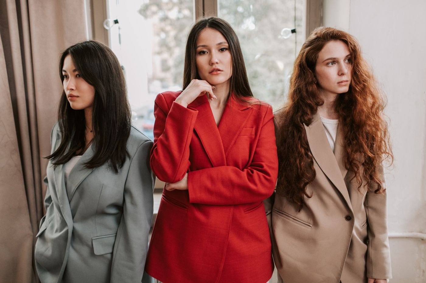

  • Fashion for Going Out: Outfit Ideas for Every Plan

    Fashion for Going Out: Outfit Ideas for Every Plan

    Fashion for going out should make getting dressed feel exciting, not like a test you can fail. Whether your plans involve a relaxed café, dinner with friends, a date, or a party, a good outfit connects the occasion with your personal style. You can look polished without buying a completely new wardrobe or wearing something uncomfortable.

    The most useful starting point is the evening itself. Think about where you are going, how you will travel, and how long you expect to stay. Then choose an outfit that lets you enjoy those plans. This guide offers adaptable going-out outfit ideas, practical styling suggestions, and answers to common questions about dressing for a night out.

    Start With Your Plans and Personal Style

    Before opening your wardrobe, identify the mood of the occasion. A casual restaurant, a rooftop gathering, and a formal celebration can call for different levels of dressiness. Check any stated dress code and consider whether your group is planning something relaxed or more dressed up.

    Next, think about the clothes that already feel like you. If you love trousers, you do not need a dress to create an evening look. If you prefer covered silhouettes, long sleeves and a flowing skirt can feel just as intentional as a fitted outfit. Personal comfort and cultural preferences belong in the decision.

    Choose one starting piece, such as a favourite dress, dark jeans, or tailored trousers. Building around a familiar item gives you a clear direction. You can make the finished outfit feel special through fabric, accessories, or a different combination rather than changing everything at once.

    Woman wearing a black top and jeans in an urban setting
    Photo: Pexels

    Casual Going-Out Outfits for Cafés and Friends

    A simple top and well-fitting jeans can be an easy foundation for an informal outing. Try a knitted top, a crisp shirt, or a blouse with an interesting neckline. Add loafers, clean trainers, or ankle boots according to your walking plans and the setting.

    Make the combination feel deliberate by considering proportions. A shorter jacket can work with high-waisted jeans, while a tucked shirt gives a clearer waistline. If you prefer an untucked top, look at where its hem falls against the trousers rather than following a rigid styling rule.

    A cardigan can also work for an evening that begins casually and continues over dinner. Our cardigan and jeans outfit guide offers more ideas for combining these familiar pieces. Choose accessories that suit the outfit instead of adding several statement items simply to make it feel dressier.

    Women enjoying dinner together in a warmly lit room
    Photo: Pexels

    Dinner Outfits That Feel Polished

    For dinner, tailored trousers and a soft blouse offer a versatile alternative to a dress. A matching trouser set can simplify the decision further. Keep the neckline, sleeves, and fit comfortable enough for sitting, eating, and conversation rather than judging the outfit only while standing.

    A midi dress is another useful option. You might choose a plain colour with distinctive jewellery or a printed dress with quieter accessories. A skirt and fine knit can achieve a similar balance, particularly when you want something that feels composed without being overly formal.

    Look at the whole outfit in the lighting available at home. Check whether fabrics become transparent under brighter light and whether the layers sit smoothly together. These small checks can help you leave feeling prepared rather than discovering an awkward detail at the restaurant.

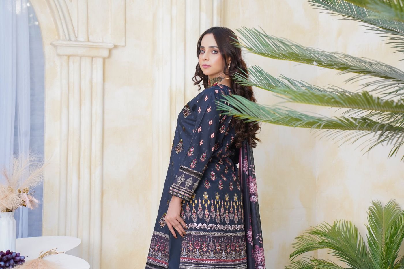
    Traditional Pakistani outfit photographed in Lahore
    Photo: Pexels

    Party Outfits With One Clear Statement

    Party dressing gives you room to experiment with shine, texture, and colour. A sequined top with plain trousers, a rich-coloured dress, or a dramatic blazer can provide a strong starting point. You do not need all three in the same outfit.

    Choose the detail you want to notice first. If the clothes already have sparkle or a bold pattern, a simple bag may create a calmer balance. If you are wearing an understated outfit, distinctive earrings or an interesting shoe can become the focal point.

    Fashion for going out works best when the finished look still feels wearable. Try moving around before leaving, particularly if the outfit has narrow sleeves, a fitted skirt, or straps that need frequent adjustment. A beautiful combination becomes less enjoyable when it requires constant attention throughout the evening.

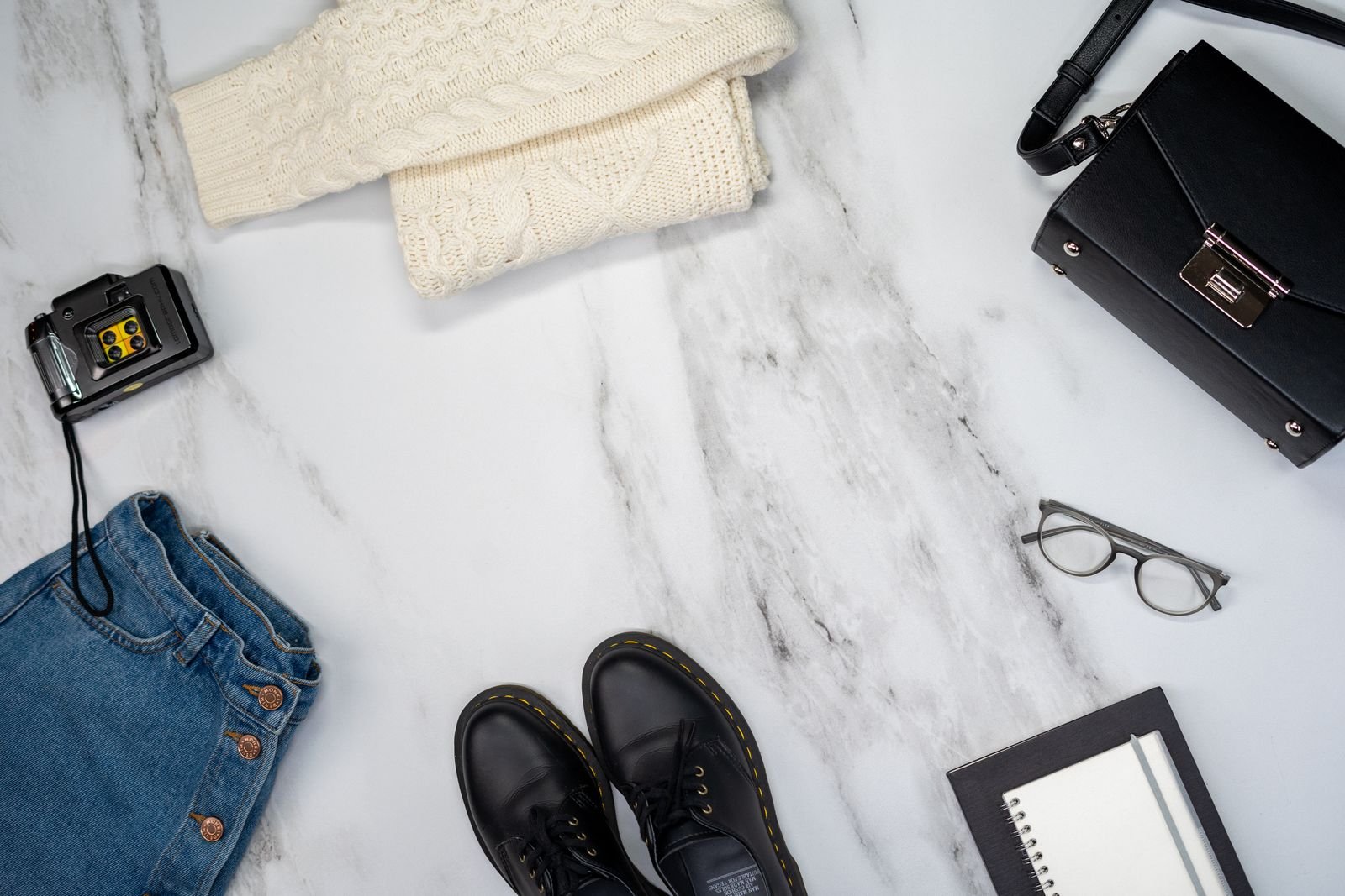
    Jeans, shoes and accessories arranged as a casual outfit flat lay
    Photo: Pexels

    Use Layers to Finish the Outfit

    A blazer can make jeans, trousers, or a simple dress feel more structured. Experiment with the sleeve length and how the jacket falls over the layer beneath it. The goal is a combination you like, not an exact reproduction of a photograph.

    In cooler weather, consider a longer coat, a neat knit, or boots that suit the forecast. A jacket should complement the outfit while also being useful during the journey. Think about where you will leave it when you arrive and whether you need a layer indoors.

    For warm evenings, lighter fabrics and a removable layer can be convenient. If you prefer a scarf, explore our silk scarf styling ideas for ways to introduce colour. Adapt the suggestion to the temperature and your own preferred coverage rather than treating accessories as mandatory.

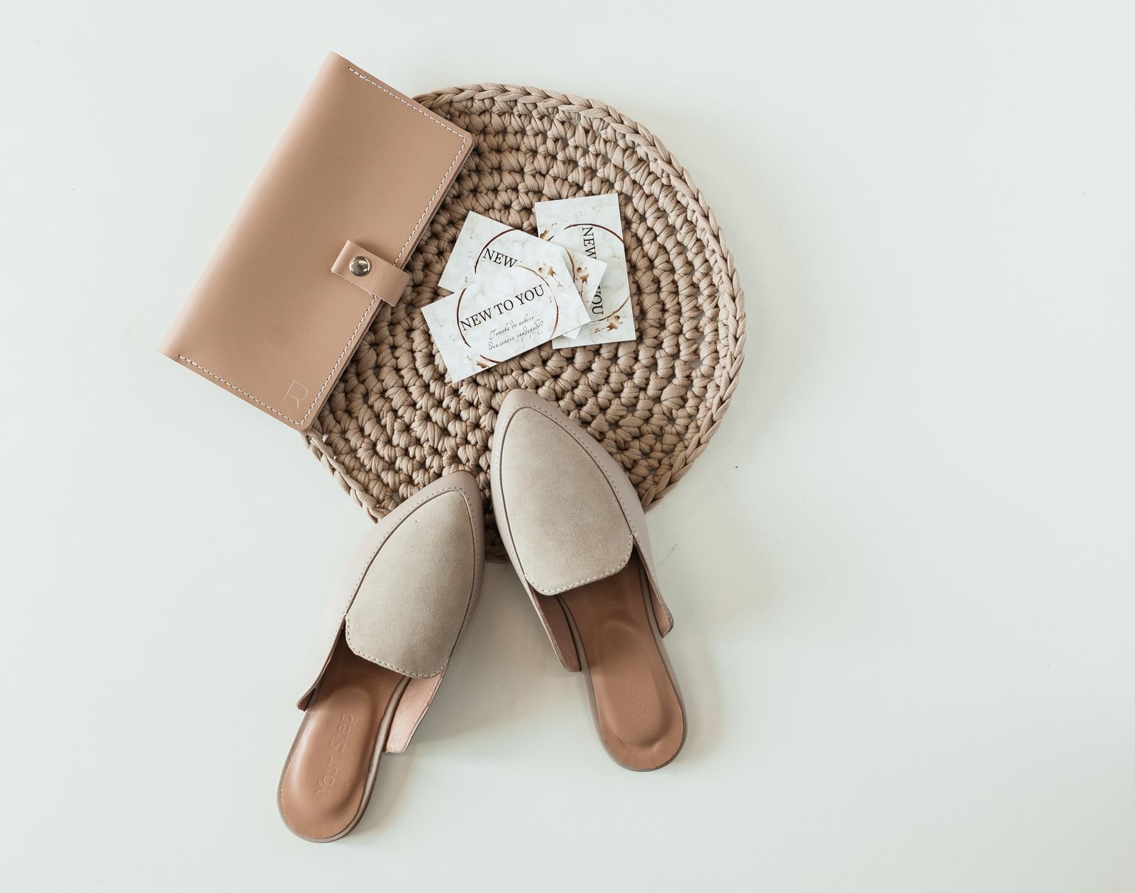
    Shoes and a purse arranged on a light surface
    Photo: Pexels

    Pick Shoes for the Whole Evening

    Choose footwear after considering the route, the venue, and the activities. Dinner with little walking presents a different situation from an evening involving public transport, dancing, or several stops. A pair you already know and enjoy wearing is often an easier choice than unfamiliar shoes.

    Heels are optional. Loafers, dressy flats, ankle boots, and understated trainers can all belong in going-out outfits when they suit the setting. Look at how the shoe shape works with your hemline and whether the outfit feels balanced to you.

    Try your complete outfit with the actual shoes before deciding. Trouser length can change the impression considerably, and a dress may feel different with boots than with sandals. Take a short walk around your room and check that the combination supports your plans.

    Make Bags and Accessories Practical

    A small bag can finish an evening look, but it should hold the things you need. Check your phone, keys, payment method, and any other essentials before choosing it. A secure closure and a comfortable strap may matter more than a striking shape.

    Jewellery can bring a simple outfit together. Consider how earrings relate to your neckline or whether a necklace competes with buttons, ruffles, or an elaborate print. You can repeat a metal finish for cohesion, but there is no requirement to match every detail perfectly.

    Use a mirror to assess the outfit as a whole rather than inspecting each item separately. If something feels too busy, remove one accessory and look again. Editing a combination can be more useful than searching for another item to add.

    Two people selecting clothes in a fashion boutique
    Photo: Pexels

    Build a Small Going-Out Wardrobe

    Keep a few reliable combinations in mind for different occasions. One casual outfit, one dinner outfit, and one party option can make future plans easier. Photograph combinations you genuinely enjoy wearing so you can remember the proportions and finishing details.

    Before shopping, identify the actual gap. You might need a useful jacket or a bag that fits your essentials rather than another statement top. Consider whether a new item works with several pieces you own. Repeating clothes in different combinations is a practical part of personal style.

    Give yourself enough time to get ready without rushing the final decision. Lay out the clothes, shoes, and accessories together, then check for missing buttons, marks, or creases. A prepared outfit can save you from last-minute changes that do not suit the evening. If your plans are uncertain, choose a flexible combination and carry a useful layer. Most importantly, leave space for your own taste. Style inspiration is a starting point for experimenting, and your favourite version may look different from the example that inspired it.

    Frequently Asked Questions

    What Does Fashion for Going Out Mean?

    It means choosing clothes for social plans outside your everyday routine. The right level of dressiness depends on the occasion, the venue, any dress code, and what makes you feel comfortable.

    Can I Wear Jeans for a Night Out?

    Yes, when the venue permits them. Pair jeans with a blouse, structured jacket, or a neat knit, then choose shoes and accessories that fit the mood of your plans.

    Do I Need Heels to Look Dressed Up?

    No. Dressy flats, loafers, and boots can create a polished outfit. The overall combination and its suitability for the setting matter more than the height of your shoes.

    How Can I Dress Up a Simple Outfit?

    Try one intentional detail, such as an interesting jacket, a distinctive bag, or statement earrings. Keep the rest of the outfit balanced so the addition feels connected to your personal style.

    What Should I Wear for a Casual Dinner?

    Consider jeans with a blouse, trousers with a knit, or an uncomplicated dress. Check the restaurant’s dress code and choose something comfortable for both the journey and the meal.

    How Can I Avoid Buying a New Outfit Every Time?

    Save photographs of combinations you like, repeat useful basics, and change one finishing detail. A different layer, shoe, or accessory can create variety while keeping familiar clothes in regular use.

  • Best Lip Balm for Chapped Lips: A Gentle Care Guide

    Best Lip Balm for Chapped Lips: A Gentle Care Guide

    Finding the best lip balm for chapped lips starts with comfort, not a fashionable flavour or an expensive label. When your lips feel tight, rough, or flaky, a simple formula is often a more useful starting point than a complicated lip treatment. The aim is to choose something you can apply consistently and tolerate comfortably.

    This guide compares practical options, explains how to read a label, and helps you build a manageable lip care routine. The recommendations are based on published ingredient information and dermatology guidance, rather than hands-on product testing. There is no single balm that suits every person, and a product should never earn a place in your routine simply because it is trending.

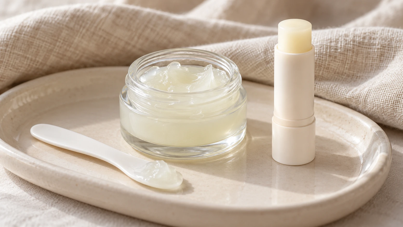
    Petroleum jelly jar, cosmetic spatula and lip balm on a cream ceramic tray

    What Makes a Good Lip Balm?

    For very dry lips, start by considering a plain, fragrance-free ointment. The American Academy of Dermatology recommends non-irritating products and identifies white petroleum jelly as an option for very dry, cracked lips. Its dermatologists’ chapped-lip guidance also stresses that burning or stinging is a reason to stop using a product.

    That makes comfort an essential selection criterion. A cooling sensation, delicious scent, glossy finish, or elaborate package does not tell you whether a formula will agree with your lips. Think about the texture you enjoy, the ingredients you tolerate, and the circumstances in which you will actually use it.

    A jar can feel convenient on a bedside table, while a small tube may fit better in a work bag. Neither format automatically performs better. The best choice is one that combines a suitable formula with packaging that makes regular application straightforward.

    Three Practical Options to Consider

    Vaseline Original Healing Jelly: A Simple Starting Point

    Vaseline Original Healing Jelly is a straightforward petroleum jelly option. The brand lists petrolatum as its ingredient. For someone wanting a minimal formula rather than fragrance, colour, or a long list of cosmetic extras, that simplicity can be appealing.

    Its thick, shiny texture is the main practical tradeoff. You may enjoy it for evening use but prefer a less noticeable finish during meetings or beneath lipstick. Buy the Original version deliberately: products with similar packaging or different flavours are not necessarily the same formula.

    Choose a size that fits your habits. A larger jar might make sense at home, while a compact container can be easier to carry. Compare the exact product name and ingredient list, rather than assuming every item from the brand offers an identical experience.

    CeraVe Healing Ointment: An Ingredient-Rich Alternative

    CeraVe Healing Ointment combines petrolatum with ceramides and hyaluronic acid. The manufacturer describes the formula as fragrance-free and lanolin-free. It is worth considering if you want a petrolatum-based ointment with additional ingredients and prefer the available tube packaging.

    This is an ointment, so expect a different application experience from a firm waxy stick. Begin with a small amount and decide whether you like the finish. More ingredients do not automatically make it the best lip balm for chapped lips; suitability still depends on personal tolerance and preference.

    Check the label sold in your country before buying. Packaging, sizes, and formulas can change. Do not substitute another CeraVe product just because its name includes moisturising or healing; identify the exact item you intend to use and follow its directions.

    A Fragrance-Free Stick: A Convenient Everyday Format

    A plain stick balm can be a practical choice when portability matters most. Rather than choosing a specific brand by popularity alone, compare fragrance-free options and their complete ingredient lists. This approach is especially useful when the products available locally differ from those mentioned in international reviews.

    Look at the mechanism as well as the formula. Does the cap close securely? Can you apply the stick neatly? Is the product easy to find again? These ordinary details can determine whether a balm becomes a dependable everyday item or stays forgotten in a drawer.

    An outdoor balm should be chosen separately for labelled sun protection. The AAD recommends a non-irritating lip product with SPF 30 or higher and reapplication every two hours outdoors. A regular ointment without an SPF label is not a substitute for that protection.

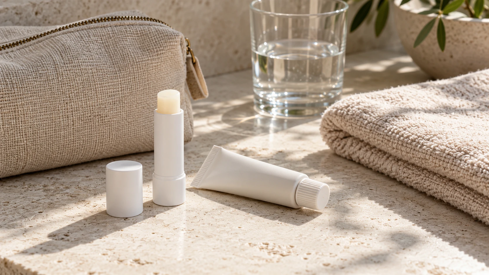
    Lip balm and ointment beside a travel pouch

    How to Read the Label Without Overcomplicating It

    Start with three questions: what is the exact product, what does the ingredient list contain, and what do the directions say? Marketing phrases such as nourishing, intensive, natural, or luxury are less useful than clear answers to those questions.

    If you already know an ingredient irritates you, check for it before purchasing. While your lips are chapped, the AAD advises avoiding potential irritants such as fragrance, menthol, camphor, and certain flavourings. A product that feels uncomfortable does not need to be finished just to justify its price.

    Keep a photograph of the packaging when you find something suitable. It can help you repurchase the same version and notice a reformulation. If you are comparing two products, write down what you actually care about: texture, scent, packaging, size, and availability.

    For a broader approach to choosing comfortable textures, explore our moisturizer guide. Lip care can be approached with the same practical mindset: choose thoughtfully, keep the routine manageable, and avoid buying several near-identical products without a clear purpose.

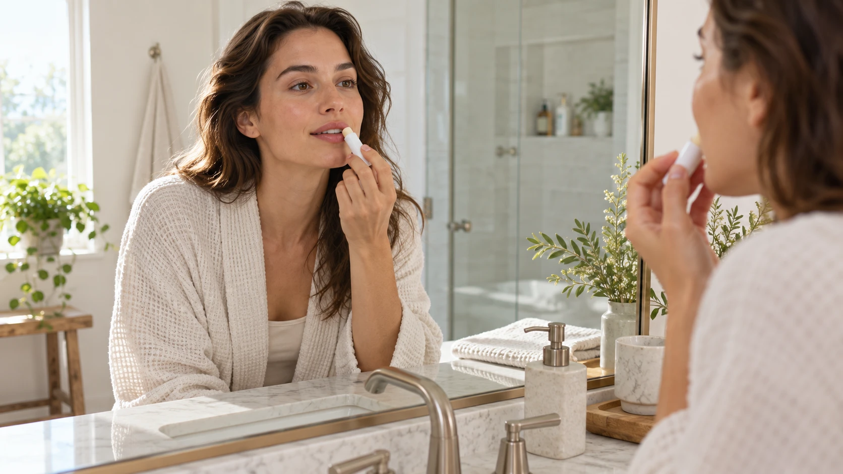
    Woman applying lip balm in a morning routine

    Build a Lip Care Routine You Can Repeat

    Keep your chosen balm somewhere visible and attach application to an existing habit, such as finishing your morning skincare. A second convenient location, like a bedside table, may help you remember evening use. The point is consistency rather than collecting products for every possible occasion.

    Use clean hands when applying a jar product, and avoid sharing your balm. The NHS includes these precautions in its advice for sore or dry lips. It also advises against picking, biting, or repeatedly licking dry lips, which can worsen soreness or slow healing.

    Keep facial products away from your lips when their instructions do not recommend lip application. Give yourself a clear place in the routine for balm instead of treating it as an afterthought. Our beginner skincare routine offers a useful framework for organising the rest of your daily care.

    If makeup is important to you, consider when you prefer to apply a richer ointment and when a lighter finish feels more convenient. You do not need identical textures for every setting. However, buying a daytime option and an evening option should solve a practical problem, not simply expand a collection.

    Shop Carefully and Set Realistic Expectations

    Compare the price per amount alongside packaging and how frequently you expect to use the product. A low purchase price is not automatically better value if you dislike the texture or repeatedly lose a poorly fitting container. Equally, expensive packaging is not evidence of superior care.

    Choose reputable sellers and inspect seals, labels, and expiry information where provided. Avoid assuming that a social media favourite will perform identically for you. Published product descriptions explain intended features; they do not replace your own experience of comfort.

    Before ordering, decide where the balm will live. A pocket product needs a secure cap and a manageable size; a bathroom product may benefit from packaging you can identify easily among other skincare items. Keep a small note about why you chose it and whether those expectations were met. This makes your next purchase more deliberate. You might discover that convenience matters more to you than shine, or that a familiar texture matters more than an unusual ingredient. Those observations are useful shopping information, even when they differ from a reviewer’s preferences or the presentation in an attractive advertising campaign online.

    Seek medical advice if your lips are hot, painful, and swollen. If persistent chapping does not improve with gentle care, a pharmacist or clinician can help you assess it. Do not keep adding stronger treatments or supplements based on guesses about the cause.

    Frequently Asked Questions

    What Is the Best Lip Balm for Chapped Lips?

    A plain, fragrance-free petroleum jelly is a reasonable starting option for very dry lips. The best individual choice also depends on tolerance, texture preference, and whether you need labelled SPF protection outdoors.

    Is an Ointment Better Than a Stick?

    An ointment offers a richer application experience, while a stick can be easier to carry. Choose based on the formula and your routine rather than assuming one packaging style suits everyone.

    Should Lip Balm Tingle?

    Tingling is not proof that a product is helping. If a balm burns, stings, or feels uncomfortable, stop using it and consider a gentler alternative.

    Can I Use the Same Balm Day and Night?

    Yes, if it suits you. For outdoor use, select a suitable SPF-labelled lip product as well; ordinary petroleum jelly does not provide labelled sun protection.

    Do I Need Several Lip Products?

    No. Start with one comfortable option and add another only for a clear reason, such as outdoor SPF or a packaging format that works better away from home.

    When Should I Ask for Help?

    Ask a pharmacist or clinician about ongoing soreness, repeated reactions, or concerning symptoms. Persistent problems deserve assessment rather than an endless cycle of buying increasingly complicated lip treatments.

  • Robert Kelker-Kelly: Biography, Soap Roles and Legacy

    Robert Kelker-Kelly: Biography, Soap Roles and Legacy

    Robert Kelker-Kelly: A Life in Daytime Television

    Robert Kelker-Kelly was an American actor whose career connected three daytime dramas: Another World, Days of Our Lives and General Hospital. Viewers remember him as Sam Fowler, Bo Brady and Stavros Cassadine, characters with very different places in soap opera history. Following reports of his death on October 3, 2026, at age 62, this biography looks at his documented work, the roles that defined his screen career and the distinction between the performer and his fictional characters.

    Who Was Robert Kelker-Kelly?

    For readers searching Robert Kelker Kelly without the hyphen, the name refers to the same television actor. He was born on April 18, 1964, and grew up in Wichita, Kansas. Rather than belonging to only one soap franchise, he moved between established shows and took on both romantic leads and a memorable antagonist. That variety is central to understanding his career. An actor associated with a familiar character can easily become reduced to that role, but Kelker-Kelly’s credits show several distinct chapters, separated by changes in both employment and personal interests.

    Early Interest in Theatre

    Kelker-Kelly attended Wichita Collegiate School and became involved in theatre before his professional television career. School productions helped introduce him to performance, and he briefly attended the University of Kansas before pursuing acting. These details provide a useful starting point without turning his childhood into a romanticised origin story. Stage experience and television acting require different rhythms, but both depend on listening, preparation and responding to scene partners. His later interviews show an interest in acting as a craft, rather than simply as a route to celebrity recognition.

    Another World and Sam Fowler

    His daytime breakthrough came in 1987 when he originated Sam Fowler on Another World. He played the character until 1990, establishing a place in a genre where stories unfold across repeated daily episodes. Sam’s relationship with Amanda Cory became an important part of that period. For viewers exploring Robert Kelker-Kelly’s Another World years, Sam should be treated as his first major soap identity, rather than confused with the character he played when he returned. This early run preceded his more widely discussed arrival in Salem.

    Becoming Bo Brady on Days of Our Lives

    In 1992, Kelker-Kelly joined Days of Our Lives as Bo Brady, taking over a role originally played by Peter Reckell. Recasting a familiar character brings an unusual challenge: the audience already has expectations about the person’s voice, relationships and behaviour. The new actor must work within an established history while finding a convincing approach. Kelker-Kelly remained in the role until 1995. His tenure belongs to a particular chapter of Bo’s story, and it should not be described as the creation of the character or the entirety of Bo’s television history.

    Bo, Hope and Billie

    During his Days of Our Lives run, Kelker-Kelly acted opposite Kristian Alfonso as Hope Brady and Lisa Rinna as Billie Reed. The connections among those characters are a major reason his portrayal remains recognisable to longtime viewers. Soap romances work through accumulated history: earlier choices affect later conflicts, and an ordinary conversation can carry the weight of many previous episodes. When revisiting the Bo Brady actor’s work, separating the character’s relationships from the actor’s private life is essential. On-screen chemistry is a performance, not evidence about an off-screen relationship.

    Awards and Recognition

    Kelker-Kelly won the 1994 Soap Opera Digest Award for Outstanding Lead Actor for his portrayal of Bo. In 1995, he and Lisa Rinna also received the magazine’s Hottest Couple award. These were Soap Opera Digest honours, not Daytime Emmy wins, a distinction that matters in an accurate biography. Awards offer a specific record of recognition at a particular time. They help place his Days work within the era, but they do not replace a careful account of his credits or explain every aspect of his experience on the programme.

    Returning to Another World

    He returned to Another World in 1996, this time as Bobby Reno, whose storyline developed into the identity of Dr. Shane Roberts. That run continued until 1998. The return is sometimes confusing in short actor biographies because the show appears twice in his career. Sam Fowler and Shane Roberts were separate characters, not interchangeable names for the same role. Keeping those identities clear makes his filmography easier to follow and shows how a familiar performer could re-enter an established series with a different narrative purpose.

    General Hospital and Stavros Cassadine

    Kelker-Kelly joined General Hospital as Stavros Cassadine in 2001, followed by appearances in 2002 and 2003. Stavros placed him in a different dramatic register from the romantic associations of Bo Brady. The Cassadine name carries a substantial fictional history within the show, and his appearances should be understood within that ongoing family storyline. Calling him a General Hospital actor is accurate, but describing his involvement as an uninterrupted decade-long contract would be misleading. His later returns were separate appearances rather than proof of continuous employment throughout the intervening years.

    The 2013 and 2014 Returns

    He reprised Stavros during General Hospital’s fiftieth anniversary period in 2013 and returned again in 2014. In an interview with BuzzWorthy Radio, he discussed the secrecy around his comeback and working again with Genie Francis and Anthony Geary. Those comments provide a first-person view of returning to a familiar production after time away. A surprise return depends partly on what viewers remember, which explains why established soap characters can reappear with immediate dramatic significance. The interview also connects his television work with the aviation career he had developed.

    A Career Beyond the Screen

    Kelker-Kelly became a professional pilot, giving his biography a chapter outside entertainment. In interviews, he discussed flying jets for a living and balancing that work with occasional acting opportunities. Aviation should be presented as an actual occupation, rather than a decorative celebrity hobby. It also helps explain why a screen career does not always follow a steady upward sequence of larger roles. A performer can change direction, build another professional identity and still return to a production when a particular opportunity fits.

    Personal Life and Public Information

    Published biographies record marriages to Linda Rattner and actress Miriam Parrish. The reporting is inconsistent about the year his marriage to Parrish ended, so a precise divorce date is omitted here. This is a useful reminder that repeating a number across celebrity websites does not automatically establish its accuracy. Likewise, widely circulated net-worth estimates should not be treated as verified financial records. A responsible profile can acknowledge a public figure’s personal background while keeping its focus on documented professional work and avoiding unnecessary speculation about private circumstances.

    October 2026 News Update

    PEOPLE reported on October 5 that a Missouri medical examiner had confirmed Kelker-Kelly died on October 3, 2026, aged 62. An official cause of death had not been disclosed in that reporting. Readers can consult PEOPLE’s report for the dated update. A biography should not turn incomplete reporting into a diagnosis or repeat unsupported explanations. His television credits and professional history can be discussed clearly while the circumstances of his death remain limited to what reliable reporting has established.

    His Place in Celebrity and Television History

    Kelker-Kelly’s career illustrates how daytime television builds recognition through characters that audiences encounter repeatedly. His award appearances also form part of the visual history of the genre, including its formalwear and publicity photographs. Readers interested in that broader connection can explore HayaGlam’s Celebrity Style collection and red carpet style lessons. For a closer account of the performer himself, the BuzzWorthy Radio interview offers his own recollections. The most useful way to revisit his work is through its distinct roles, dates and creative contexts.

    Frequently Asked Questions

    What was Robert Kelker-Kelly best known for?

    He was best known for playing Bo Brady on Days of Our Lives from 1992 to 1995. His other major soap roles included Sam Fowler and Shane Roberts on Another World, plus Stavros Cassadine on General Hospital.

    Did he create the role of Bo Brady?

    No. Peter Reckell originated Bo Brady before Kelker-Kelly joined Days of Our Lives. Kelker-Kelly played a later version of the established character, and Reckell subsequently returned.

    Was he also a pilot?

    Yes. Professional aviation became an important part of his working life. He discussed flying jets in interviews while explaining how he balanced that occupation with occasional returns to acting.

    When did Robert Kelker-Kelly die?

    He died on October 3, 2026, at the age of 62, according to the reporting published on October 5. The cause of death had not been publicly disclosed in the cited report.

    Which Another World characters did he play?

    He originated Sam Fowler in 1987 and played him until 1990. He later returned as Bobby Reno, also known as Dr. Shane Roberts, from 1996 to 1998. These were different roles.

    Did Robert Kelker-Kelly win a Daytime Emmy?

    The honours discussed here are Soap Opera Digest Awards: Outstanding Lead Actor in 1994 and Hottest Couple with Lisa Rinna in 1995. They should not be labelled as Daytime Emmy Awards.

  • Dog Wallpaper: 52 Cute Dog Backgrounds for Your Screen

    Dog Wallpaper: 52 Cute Dog Backgrounds for Your Screen

    Dog wallpaper ideas for a happier screen

    A dog wallpaper can give your phone or desktop a cheerful focal point. Choose an expressive portrait, a playful garden scene, or a dog relaxing in the sunshine. This collection brings together 52 dog photographs in 13 breed tabs, so you can browse different looks without scrolling through every image at once. From golden retrievers to spotted Dalmatians, there is room to choose a background that matches your favourite colours, screen layout, and personal style.

    Browse the dog wallpaper gallery

    Open a breed tab to see four photographs, then compare the dog’s position, the background, and the available space around the subject. Each image includes descriptive alternative text and a source credit. Portrait compositions can be useful for phones, while wider photographs usually need less cropping on a desktop. The gallery also includes different proportions, giving you options beyond a single fixed screen size. Check the source information to explore each original image.

    Golden retriever wallpaper

    Golden retriever photographs bring warm coat colours and expressive faces to a screen. A close portrait can work beautifully on a lock screen, especially when the eyes sit below the clock. Wider outdoor photographs offer more room for desktop icons. Compare the lighter fur with your text colour before choosing a crop, because bright highlights can reduce the contrast of white labels.

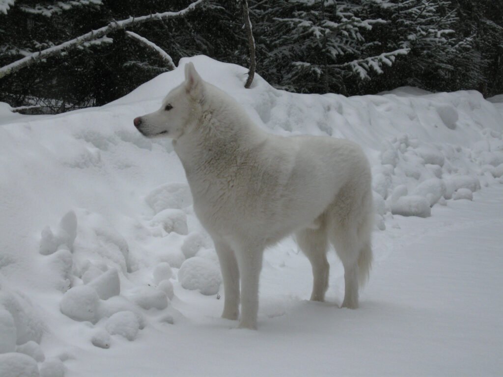
    Husky wallpaper

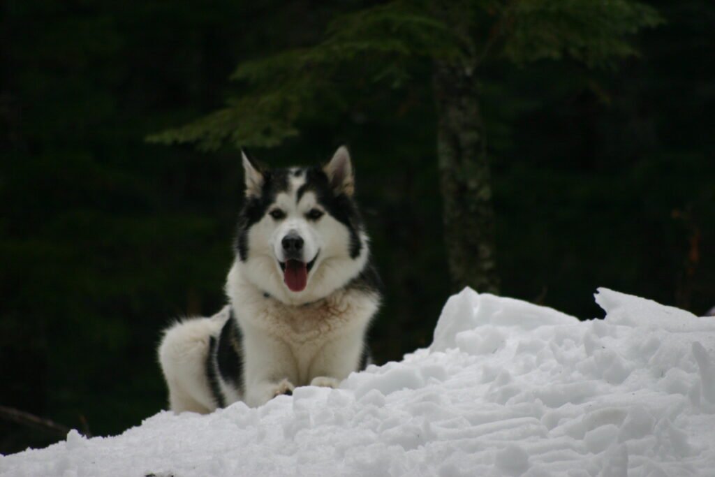
    Husky images often feature strong facial markings that remain noticeable even in a small preview. A portrait can emphasise the face, while a wider composition gives the surrounding landscape more space. Keep the ears inside the crop when possible. Cutting closely around the head may make an otherwise striking photograph feel cramped once your phone adds its clock and notification area.

    Beagle wallpaper

    Beagle photographs offer a familiar combination of soft ears, distinctive markings, and curious expressions. A relaxed portrait suits a simple home screen, while an outdoor scene brings a more playful mood. Leave enough room around the muzzle and ears when adjusting the wallpaper. A slightly wider crop can preserve the character of the photograph without making the dog too small.

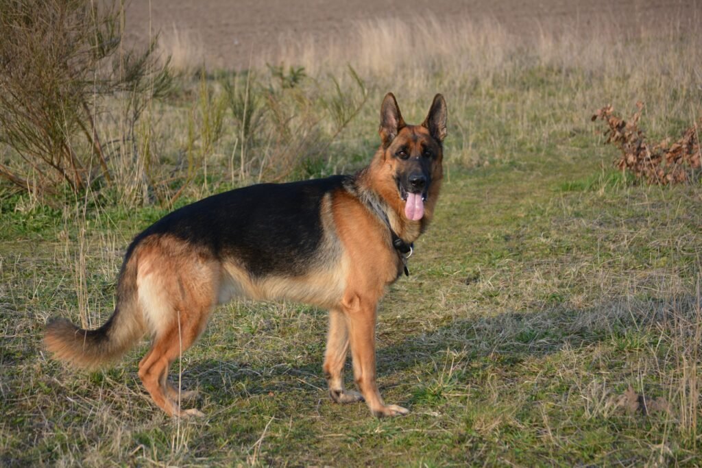
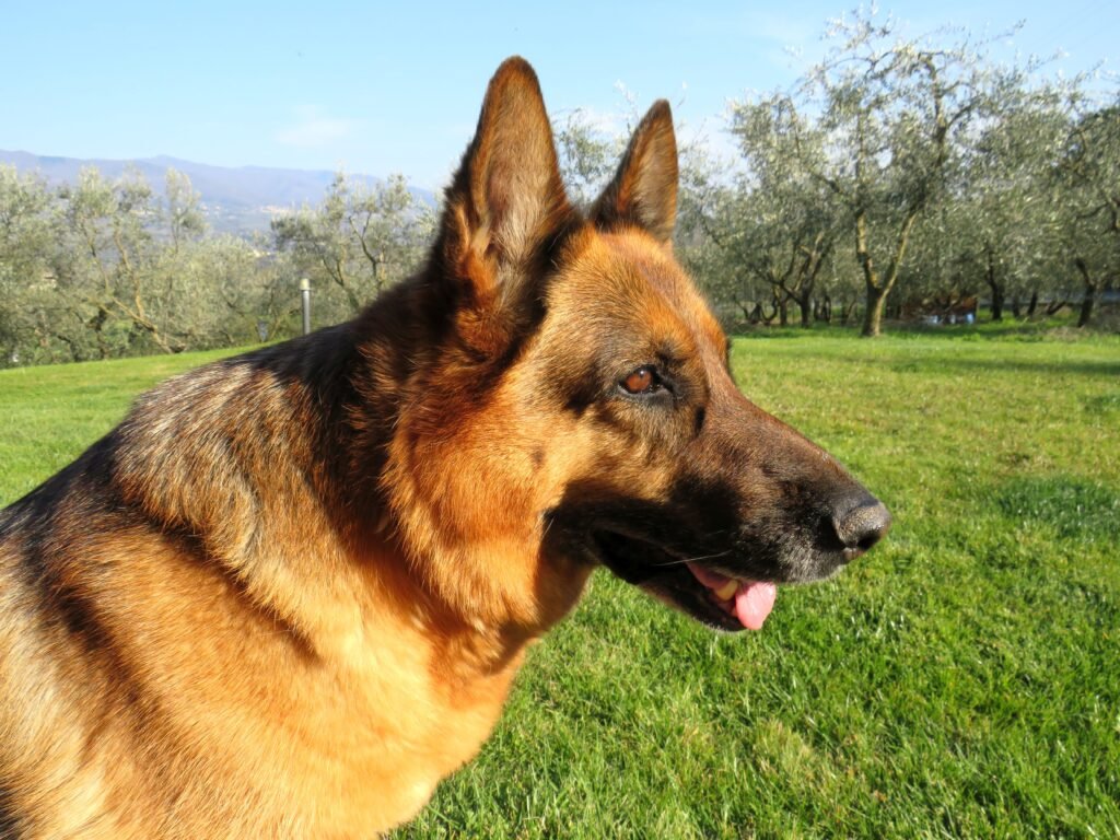
    German shepherd wallpaper

    German shepherd backgrounds can feel especially expressive when the face and upright ears are clearly visible. Darker coat areas may help pale screen text stand out, although the background matters just as much. Choose a composition with a quieter corner for shortcuts. On a narrow phone display, check that the crop keeps both the head and the surrounding space balanced.

    Labrador wallpaper

    Labrador photographs provide different coat colours and settings to explore. A simple portrait may suit a clean screen, while a dog photographed outdoors adds natural texture. Think about the overall brightness before choosing an image. Dark fur can blend into a dark background, and pale fur can compete with white labels, so preview the complete screen before applying your choice.

    Pomeranian wallpaper

    Pomeranian images draw attention through their fluffy coats and compact silhouettes. A close photograph can make the face the main feature of a phone screen. On a desktop, a wider view gives the coat texture room to breathe. Avoid enlarging the preview excessively: fine fur details look better when you begin with a sufficiently large photograph and use a modest crop.

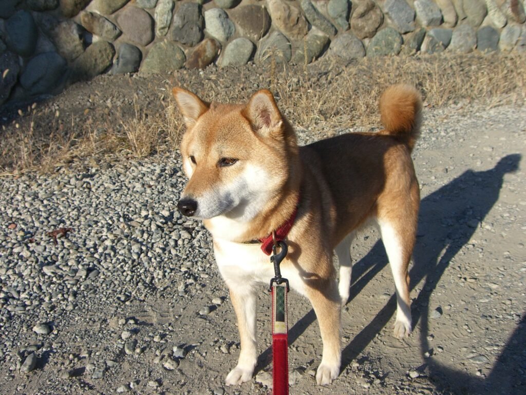
    Shiba Inu wallpaper

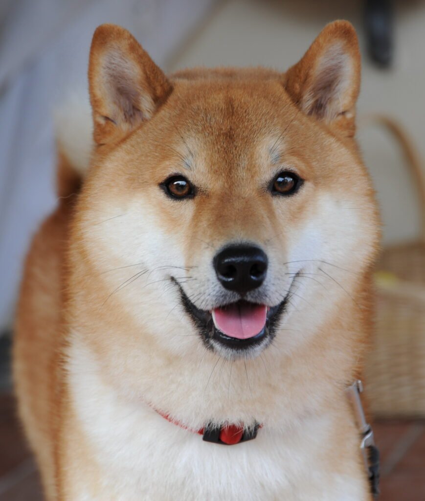
    Shiba Inu photographs often create a clear focal point through the shape of the ears, face, and curled tail. Some compositions suit a minimal background, while others include more of the dog’s surroundings. Decide which detail you want to keep before cropping. A full-body photograph can lose its balance if the tail or feet disappear at the screen’s edges.

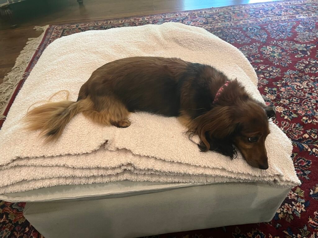
    Dachshund wallpaper

    Dachshund photographs can work particularly well across a wider screen when the full body is visible. A close portrait gives a different effect and may fit a phone more naturally. Let the composition guide your choice instead of forcing every photograph into the same crop. Keep enough space around the dog to preserve its proportions and the feeling of the scene.

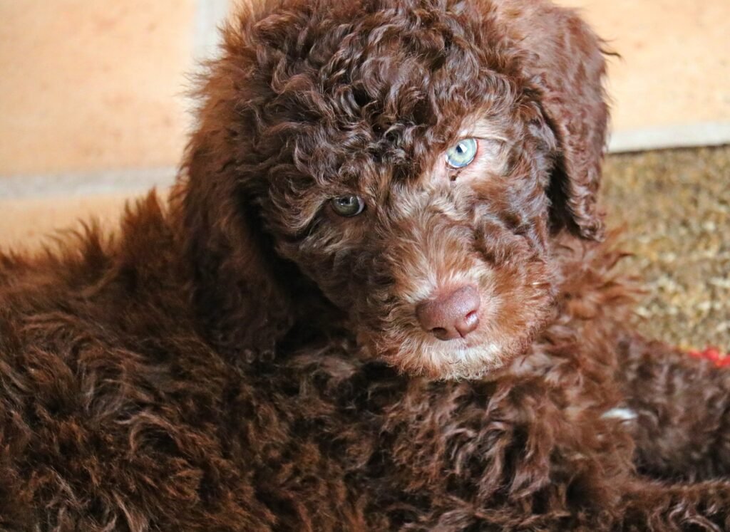
    Poodle wallpaper

    Poodle images offer curly coat textures and a variety of photographic styles. A detailed portrait can feel elegant, while a wider outdoor scene creates a more relaxed background. Notice where the brightest curls fall before placing screen text over them. If the photograph feels busy behind your apps, use it on the lock screen and choose a quieter home-screen background.

    Border collie wallpaper

    Border collie photographs can provide strong contrast between coat markings and the surrounding grass or landscape. Look for a clear face and a composition that leaves useful space around the subject. A wider image may suit a desktop with shortcuts along one edge. For a phone, choose a crop that keeps the eyes visible without cutting the ears too tightly.

    Corgi wallpaper

    Corgi backgrounds can highlight expressive ears, a low silhouette, or a full outdoor scene. A face-focused portrait is easy to recognise on a phone, while a wider photograph can preserve more of the dog’s stance. Consider the height of your widgets before positioning the image. Moving the crop slightly may keep the face clear while leaving the screen comfortably readable.

    Chihuahua wallpaper

    Chihuahua photographs offer small-scale subjects with plenty of personality in their expressions and posture. A close portrait can create a strong focal point without filling the screen with background detail. Wider photographs can also work if the dog remains noticeable after cropping. Test the wallpaper at its actual display size rather than judging only from a large gallery preview.

    Dalmatian wallpaper

    Dalmatian images bring a distinctive spotted pattern to the collection. Those markings can be visually lively, so a simpler background often helps the screen feel balanced. A portrait focuses attention on the face, while a wider image lets you enjoy the coat pattern across the body. Keep important labels away from areas where small dark spots make the text difficult to read.

    Choose the right dog wallpaper for your phone

    Start by matching the photograph’s composition to your screen. A tall image often needs less cropping, but the placement of the dog matters more than orientation alone. Leave space for the clock near the top and check where notifications appear. If your phone automatically zooms the picture, adjust the position carefully. Preview both the lock screen and home screen, since an image that looks clear without icons can feel crowded once your usual apps are visible.

    Choose a comfortable desktop background

    Landscape photographs usually fit a laptop or desktop more naturally than narrow portraits. Look for a quieter area behind your shortcuts and keep the dog’s face away from menus or frequently used widgets. A proportional fill setting may crop the edges, while a fit setting may leave space around the picture. Avoid stretching the photograph, which can distort the dog’s proportions. For an ultrawide monitor, choose a broad scene and check the crop before applying it.

    Understand image size and clarity

    Image dimensions tell you how many pixels a file contains. A larger photograph generally gives you more room to crop, but a high pixel count does not guarantee that every detail is perfectly sharp. The gallery previews are designed for browsing and may be smaller than the source files. Check the linked source page for the original dimensions and available versions. Avoid relying on screenshots when you want the clearest wallpaper, because screenshots preserve only the pixels displayed on your screen.

    Frequently asked questions

    Which dog wallpaper is best for a phone?

    Choose a photograph that keeps the dog’s face visible and leaves space for the clock and notifications. Portrait images are often convenient, but a landscape photograph can also work when the subject sits in a useful position. Preview the crop on your own device.

    Can I use these images on a desktop?

    Yes, many of the wider compositions suit a desktop background. Check the source dimensions and choose a proportional fit or fill setting. Your monitor’s shape determines how much of the photograph remains visible, especially if you use an ultrawide display.

    Are all the dog wallpapers 4K?

    No. The photographs have different original dimensions, and the gallery does not label every image as 4K. Use each source link to check the original file information and select a version appropriate for your screen. Avoid enlarging a small preview unnecessarily.

    How can I save a dog photograph?

    Open the source link below the photograph to find the original file and its available sizes. Save the version you need through your browser, then select it in your device’s background settings. Browser controls and wallpaper-setting labels vary between devices.

    Can I reuse a photograph elsewhere?

    Check the licence linked beneath that specific image. Some photographs require attribution, and some have additional sharing conditions. Keep the creator credit and source information when required. The collection’s images do not all carry the same licence, so review each one separately.

    Where can I find more wallpaper ideas?

    Explore HayaGlam’s Wallpaper category for other collections, including floral backgrounds. Save different dog images to refresh your screen. Keep favourite files organised.

  • Floral Wallpaper Flowers: 40 HD Phone and Desktop Backgrounds

    Floral Wallpaper Flowers: 40 HD Phone and Desktop Backgrounds

    Floral wallpaper flowers for phone and desktop

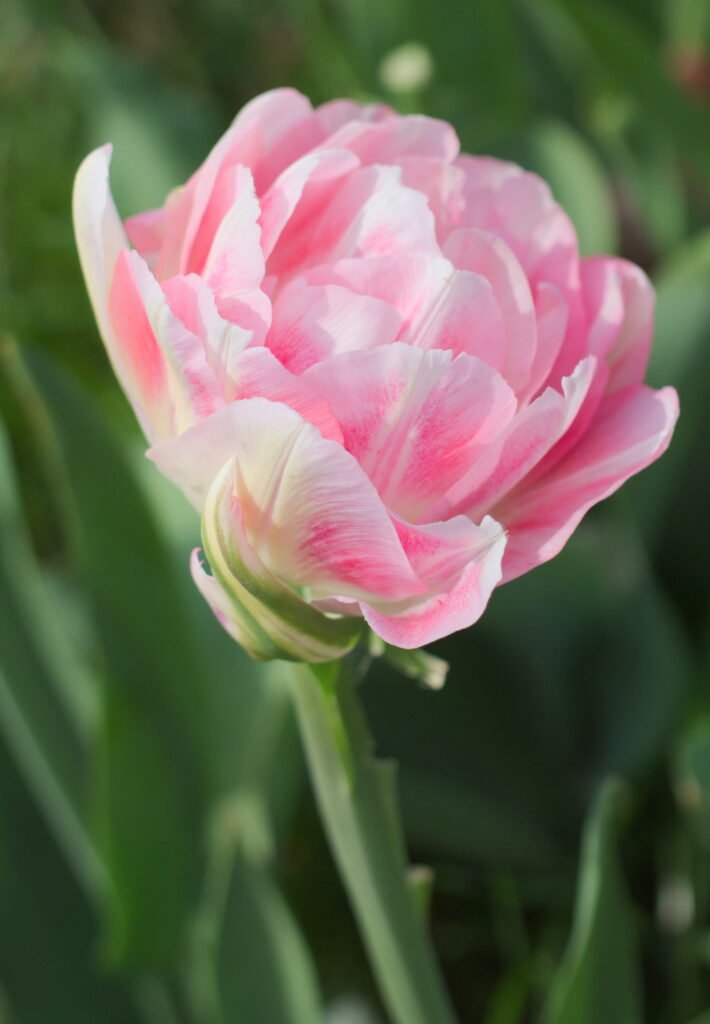
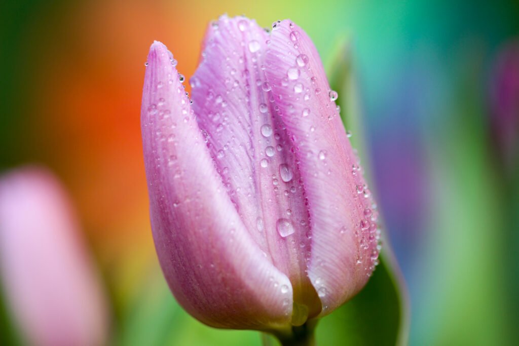
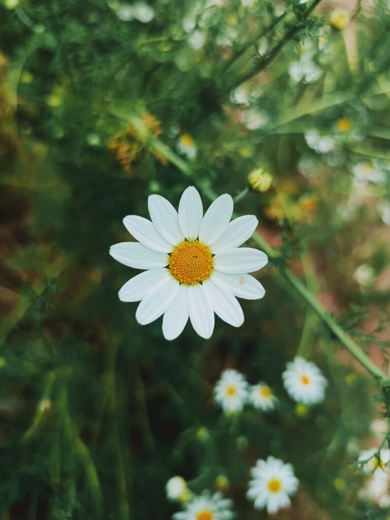
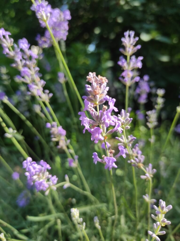
    Floral wallpaper flowers bring colour, texture, and a little garden atmosphere to the screens you use every day. A rose close-up can make a lock screen feel romantic, while a wider photograph of sunflowers adds warmth to a desktop. This collection gives you ten flower categories to explore, with four photographs in every tab. Each category includes two portrait images for phones and two landscape images for desktops, making forty wallpapers altogether. Browse the previews, compare their compositions, and download the original files when you find a favourite.

    Explore ten flower wallpaper categories

    The tabs organise the collection by flower rather than mixing every photograph into one long gallery. You can move between roses, tulips, sunflowers, daisies, lavender, cherry blossoms, lotus flowers, orchids, peonies, and hibiscus. Within each tab, the phone choices appear first, followed by the desktop choices. Captions show the image dimensions and include a creator credit and source link. Every photograph also has descriptive alternative text. Choose the flower you enjoy, then pick the orientation that best matches your screen.

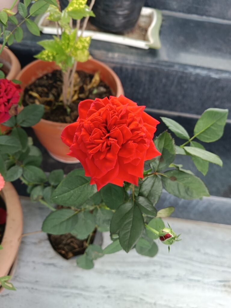
    Rose wallpaper: soft petals and rich colour

    Roses suit a screen with a romantic, classic mood. Their layered petals offer plenty of detail, whether you prefer a gentle pink flower or a stronger red bloom. For a phone, choose a portrait photograph that keeps the rose clear of the clock. For a desktop, a wider composition can balance the flower with foliage or background space. Check the preview with your usual icons in mind: a beautiful rose should remain visible once your screen becomes part of everyday use.

    Tulip wallpaper: simple shapes and spring freshness

    Tulips have clean silhouettes that work especially well in floral backgrounds. A single upright stem can give a phone screen a clear focal point, while a group of flowers brings rhythm to a landscape photograph. Their cup-shaped petals and smooth leaves offer a different feel from densely layered roses. Try a tulip image when you want a bright, uncomplicated composition. Keep some space around the blossom as you crop, so its shape remains easy to recognise on a narrow screen.

    Sunflower wallpaper: warmth for your screen

    Sunflowers combine bold yellow petals with darker centres, creating a strong natural contrast. They can make a desktop feel lively without needing extra colour effects. A closer portrait image gives your phone one main flower to enjoy; a wider view can spread the warm tones across a monitor. Bright petals sometimes sit behind white text, so preview your lock screen before applying the image. Moving the crop slightly may improve readability while preserving the cheerful character of the photograph.

    Daisy wallpaper: light and relaxed floral style

    Daisies offer a lighter, informal look with their open faces and simple petals. They suit a screen that feels fresh rather than elaborate. White petals against green plants create a gentle contrast, while a cluster of flowers adds texture across a desktop. On a phone, keep the central flower away from the most crowded rows of apps. If you prefer a quiet background, choose the image with more space between blooms and fewer small details behind your notifications.

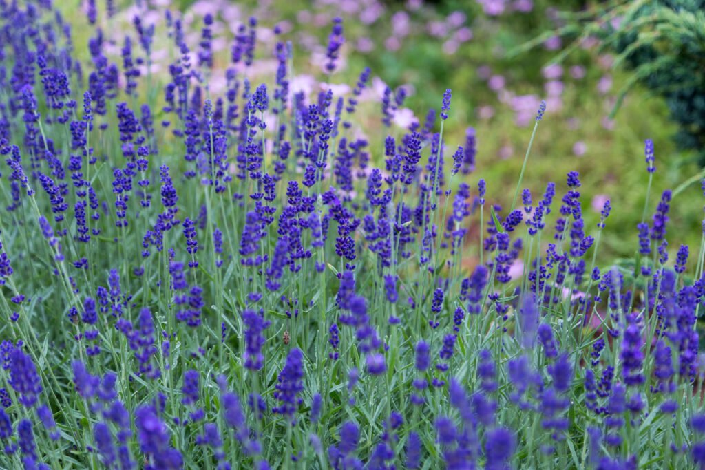
    Lavender wallpaper: delicate stems and gentle tones

    Lavender brings slender flower spikes and soft purple shades to a botanical screen. Its upright growth can fit portrait compositions naturally, while broader views introduce repeating stems and garden texture. These images pair well with a restrained arrangement of icons. Look for a crop that preserves the length of the stems rather than cutting every flower head at the edge. If a detailed scene feels busy on your home screen, use it on the lock screen and keep your apps over a calmer background.

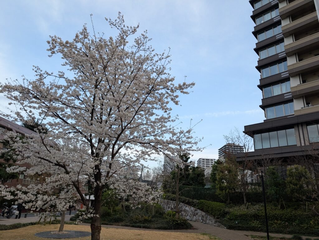
    Cherry blossom wallpaper: airy seasonal beauty

    Cherry blossoms introduce delicate petals and branching shapes that give a wallpaper a light spring mood. The gaps between flowers can be useful for clocks and widgets, especially in portrait photographs. A landscape image lets you enjoy more of the surrounding branches. When adjusting the crop, avoid placing the most detailed cluster directly underneath important text. Soft blossom colours can look different at various brightness settings, so check the wallpaper in the lighting conditions where you normally use your device.

    Lotus wallpaper: a clear botanical focal point

    Lotus flowers have distinctive petals and often appear with broad leaves or water nearby. Their strong shape can give a phone background an obvious centre of attention. A landscape composition leaves room for the setting, which may suit a desktop with icons arranged along one side. Choose a crop that keeps the full flower visible where possible. The quieter parts of the photograph can provide useful space for labels, helping the screen stay practical while keeping the botanical subject prominent.

    Orchid wallpaper: sculptural flowers and detail

    Orchids offer unusual petal shapes and interesting patterns, making them a good choice when you want something different from familiar garden blooms. A portrait photograph can highlight a flowering stem, while a landscape view may show several blossoms together. Their fine details are best appreciated from the full-resolution download. Avoid enlarging a small preview to fill your display. Instead, begin with the original file and adjust its placement until the flower and your screen information both have enough room.

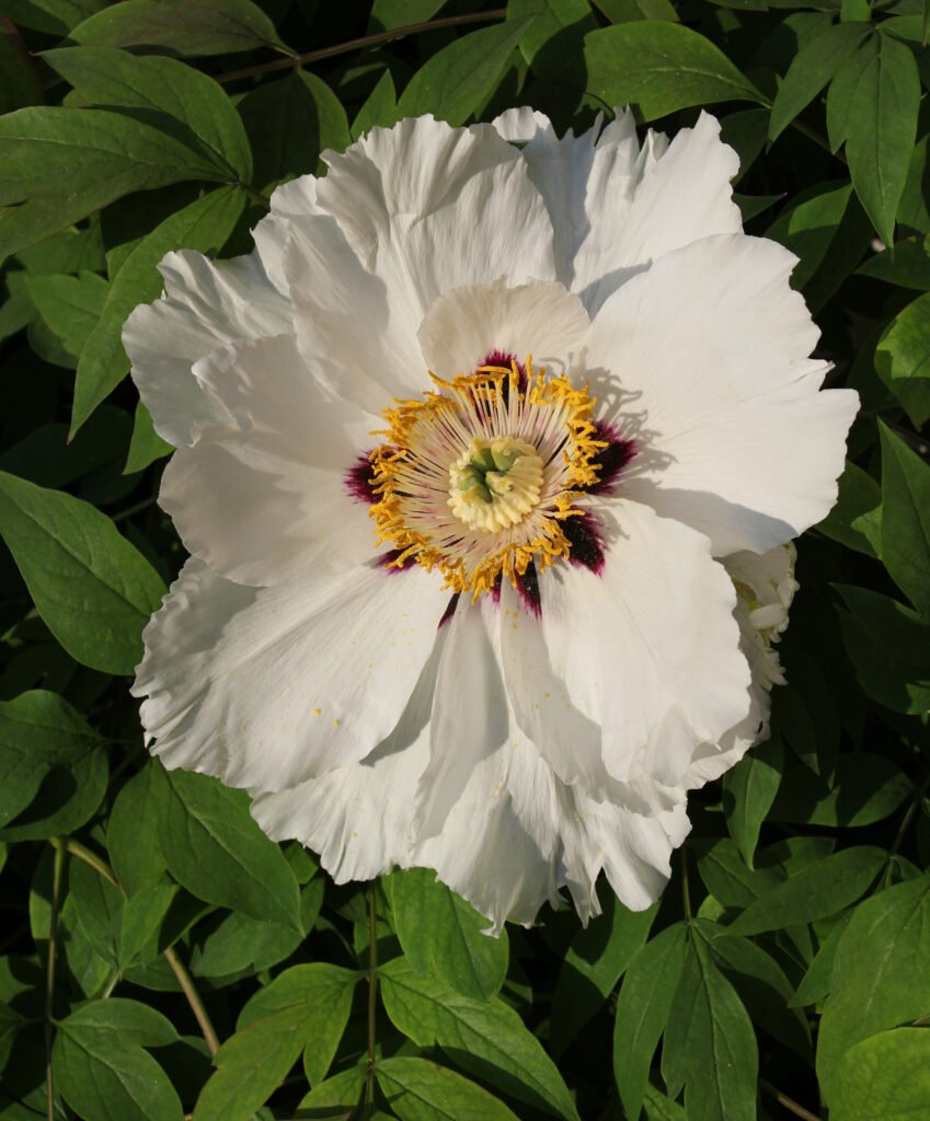
    Peony wallpaper: full blooms and soft texture

    Peonies bring generous petals and rounded flower heads to a wallpaper collection. Their dense texture can feel rich even when the colour palette stays gentle. A close portrait composition makes the bloom the main feature of a lock screen. Wider photographs give the surrounding leaves a larger role. Because a full peony can occupy much of the frame, try several crops before deciding. Leave the centre of the flower visible and move widgets into a simpler area when your device allows it.

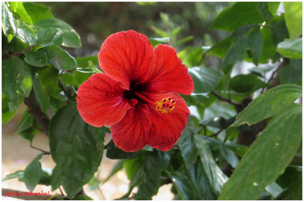
    Hibiscus wallpaper: bold petals and garden colour

    Hibiscus flowers offer broad petals and a distinctive central column, creating a striking focal point. They work well when you want a brighter, more expressive floral screen. A portrait image can emphasise one flower, while a landscape image introduces more foliage and space around it. Check that the central detail does not disappear beneath the clock or shortcuts. A small shift in placement can preserve the flower’s shape and make the background much easier to enjoy throughout the day.

    Phone and desktop sizes explained

    Phone wallpapers in this collection use portrait photographs; desktop wallpapers use landscape photographs. Their original proportions vary, so they are not all identical screen-shaped files. Each caption lists the actual width and height in pixels. A typical 4K desktop has 3840 by 2160 pixels, while the equivalent portrait orientation reverses those dimensions. These high-resolution originals leave room for a suitable crop. Your device may still trim the edges to match its particular screen ratio, especially on a tall phone or an ultrawide monitor.


    Download the original wallpaper

    Use the download button under your chosen photograph to save its ZIP archive. Extract the archive to find the original image, then open that image in your device’s wallpaper or background settings. The ZIP keeps the full-size file available without the smaller image version used for browsing. Avoid saving a screenshot of the preview, because it only captures the displayed pixels. Keep the original download so you can try a different crop later without repeatedly compressing or enlarging the photograph.

    Build a small collection of favourites

    You do not need to settle on one floral background forever. Save a few favourites with different colours and levels of detail, then change them when your screen needs a fresh look. A pale blossom may suit a quiet working day, while a sunflower can feel brighter during a weekend. Keep the downloads in a clearly named folder so you can find the original files again. When comparing two images, use the same display brightness and similar crops. This makes it easier to judge the composition instead of choosing only the brightest preview.

    Choose natural detail over heavy effects

    Petal texture, small droplets, and the shape of leaves can give a flower photograph interest without extra filters. Look closely at your chosen image after setting the wallpaper. If the subject appears too enlarged, reduce the zoom or choose another composition from the same flower tab. A different photograph often gives a better result than forcing a tight crop. Let the natural colours guide your choice of widgets and icon placement.

    Make your floral wallpaper comfortable to use

    Preview the background with your clock, notifications, and usual icons before applying it. Keep important text over a calmer part of the photograph and use a proportional crop rather than stretching the image. You can choose different wallpapers for your lock screen and home screen, or use a quieter desktop image while working. The source and licence links beneath each photograph let you check its original information. Explore HayaGlam’s Wallpaper category as more collections are added, and save your favourite flowers for an easy screen refresh. Keep several options available for different moods, seasons, and devices.

  • Best Cute Nail Ideas: 10 Pretty Manicures to Try

    Best Cute Nail Ideas: 10 Pretty Manicures to Try

    The best cute nail ideas do not need an elaborate design on every finger. A soft colour, a neat tip or one playful detail can make a manicure feel personal. Start with a length that fits your routine, then choose the colour and finish you will enjoy looking at throughout the week.

    This guide brings together ten wearable directions, with two real photographs for each idea. The pairs show variations rather than identical salon sets. Use them to discuss colour, shape and detail with your nail artist. Photography, lighting and screens can change how polish looks, so compare an actual colour sample before choosing.

    1. Soft pastel nails

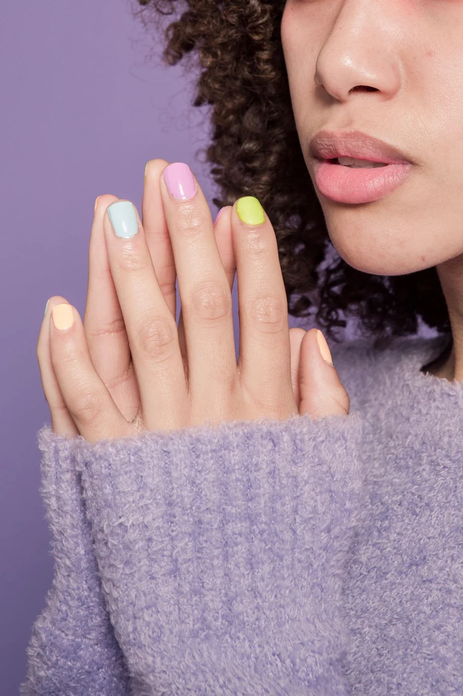
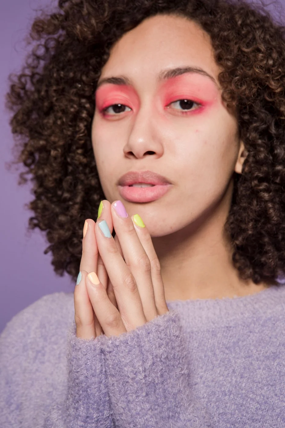
    Pastel nails feel cheerful without needing a complicated pattern. Try a small palette of lilac, pale pink and mint, letting each nail carry one colour. Keeping the finish consistent helps the shades look like a deliberate set rather than leftover polish. Rounded or softly squared tips keep the overall mood relaxed.

    For your own version, choose three colours that share a similar softness. If one shade is much brighter, use it on a single accent nail. A pastel manicure pairs easily with textured knitwear and simple jewellery. The two photographs show the palette from different poses, helping you see how the colours work together.

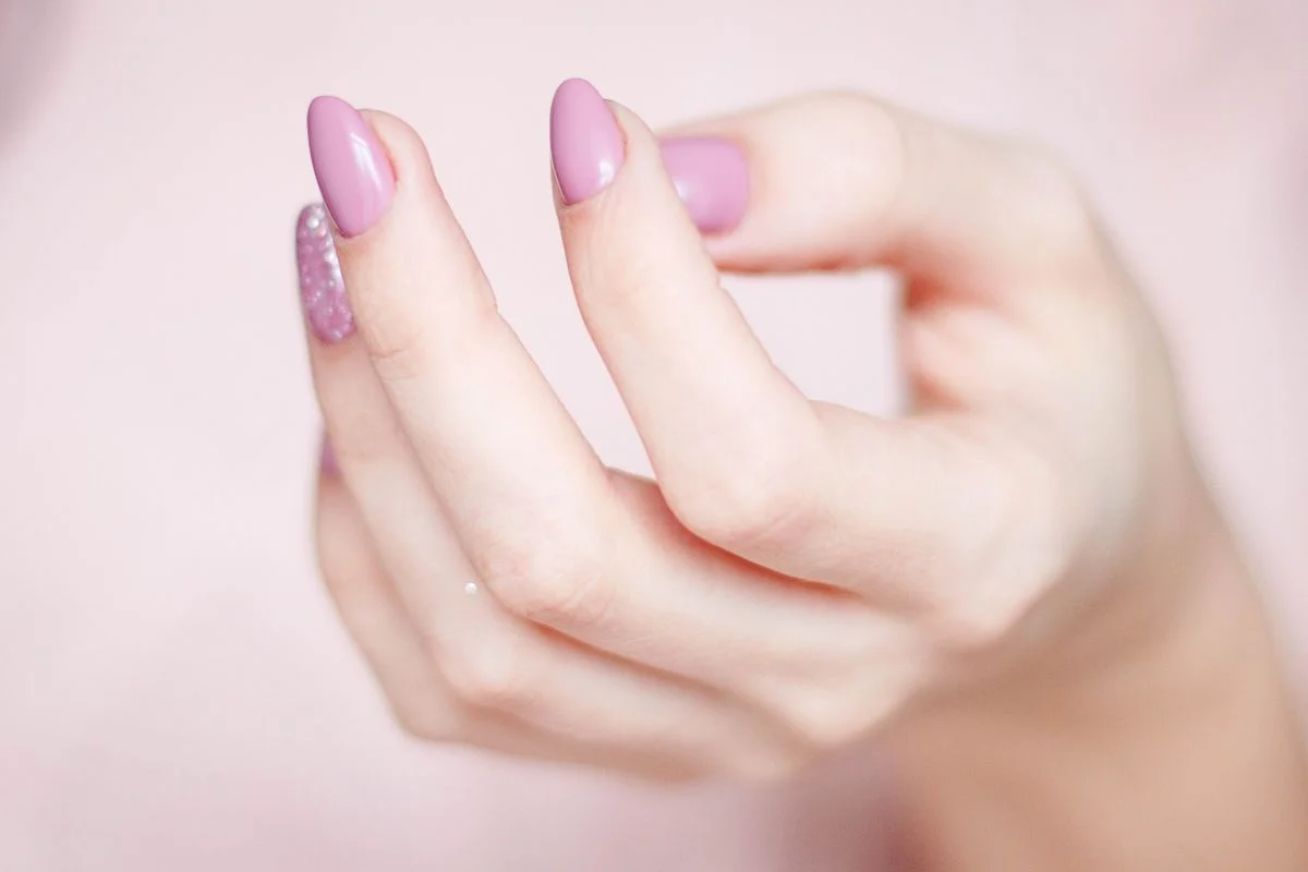
    2. Pink nails with a little sparkle

    A pink manicure becomes more playful when you introduce a small glitter accent. Keep most nails smooth and let one or two carry the sparkle. That contrast makes the detail easier to notice and avoids covering every nail with a busy finish. Fine shimmer creates a quieter effect than chunky particles.

    The pink photograph offers a clear starting point, while the second image shows a more embellished finish for comparison. Borrow the balance rather than copying every decoration. Tell your nail artist whether you prefer subtle shine or obvious sparkle, and ask to see a sample. A photograph cannot reliably identify the polish product or application method.

    3. French tips with a colour twist

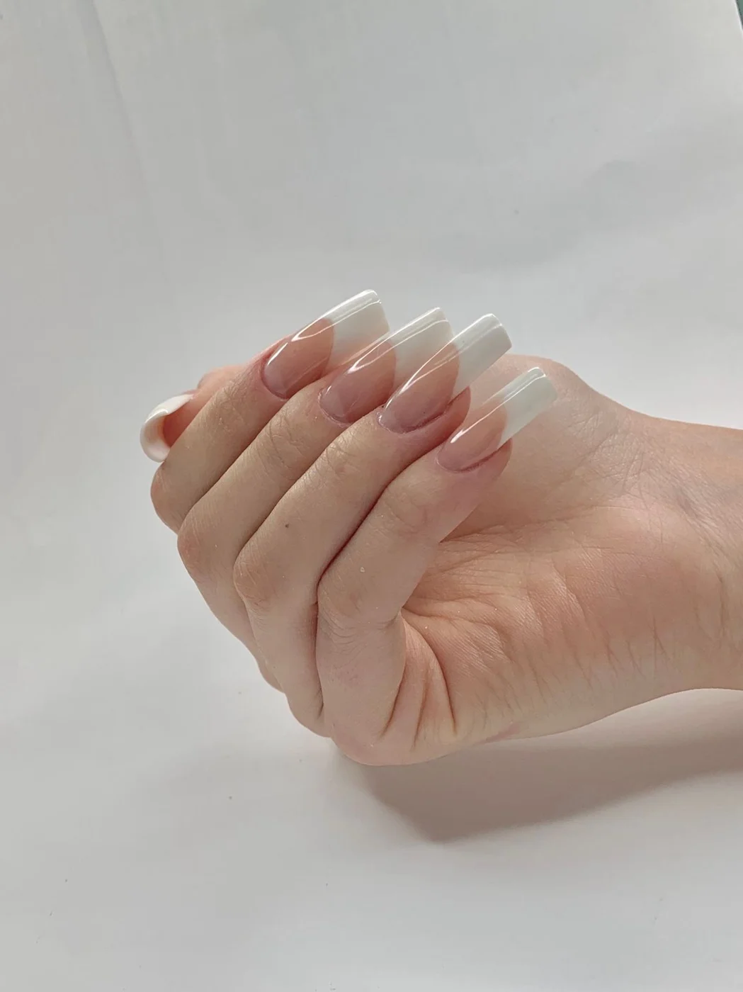
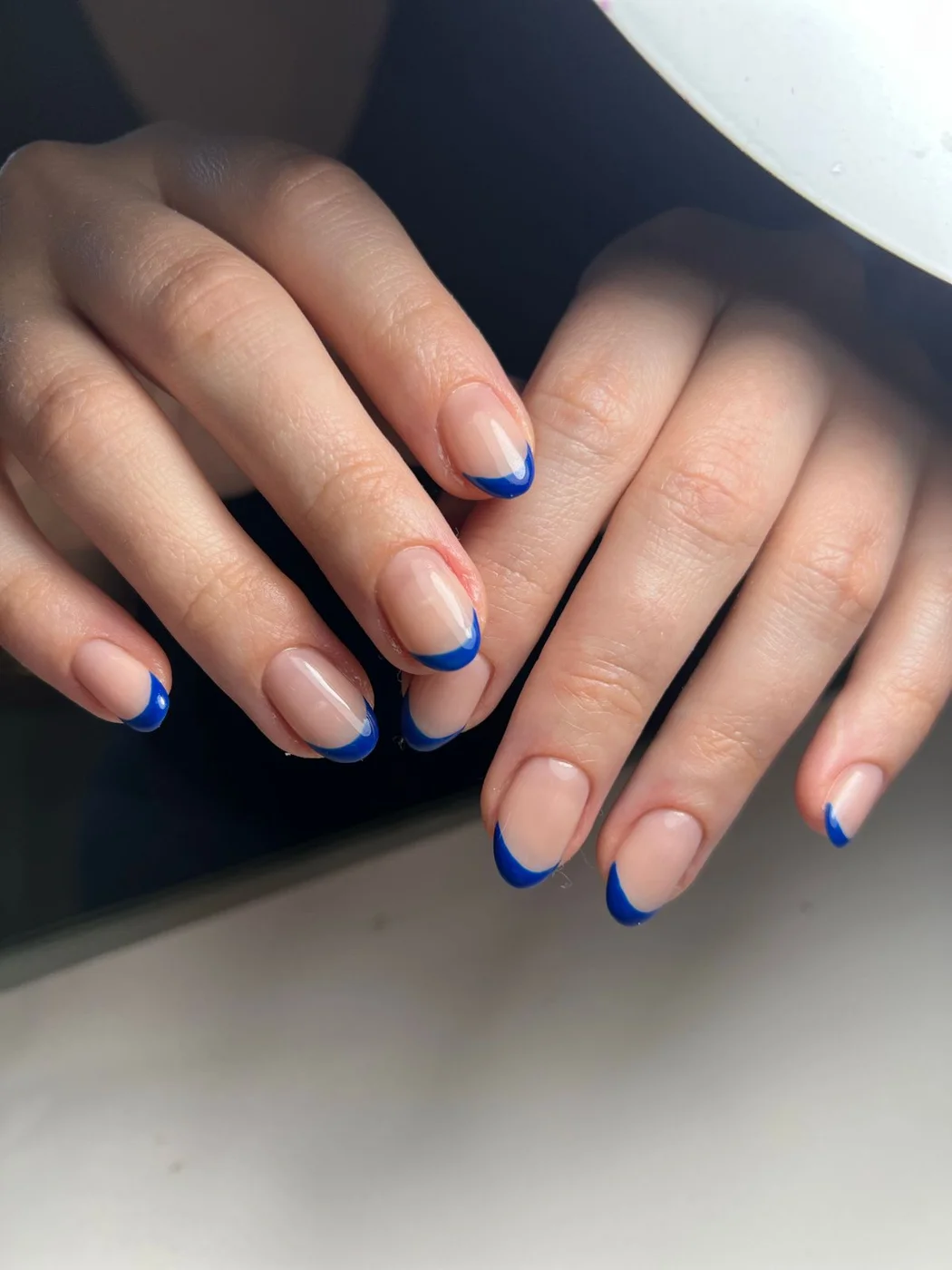
    French tips are useful when you want a defined detail and a softer-looking base. A narrow white edge feels classic, while a blue tip gives the same basic idea a brighter personality. These references show different approaches, so use them to decide whether you want the tip to whisper or stand out.

    Agree on the width of the edge before the manicure begins. On short nails, a very broad tip can take over the design. Keep the curve consistent and choose a base that looks good beside your skin rather than requesting a generic nude. Bring the photographs together if you want the artist to understand the contrast.

    4. Glossy red nails

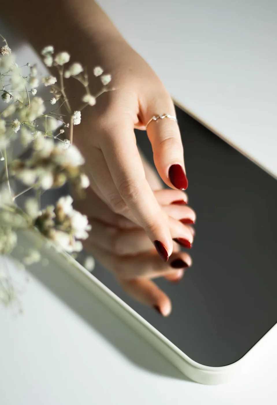
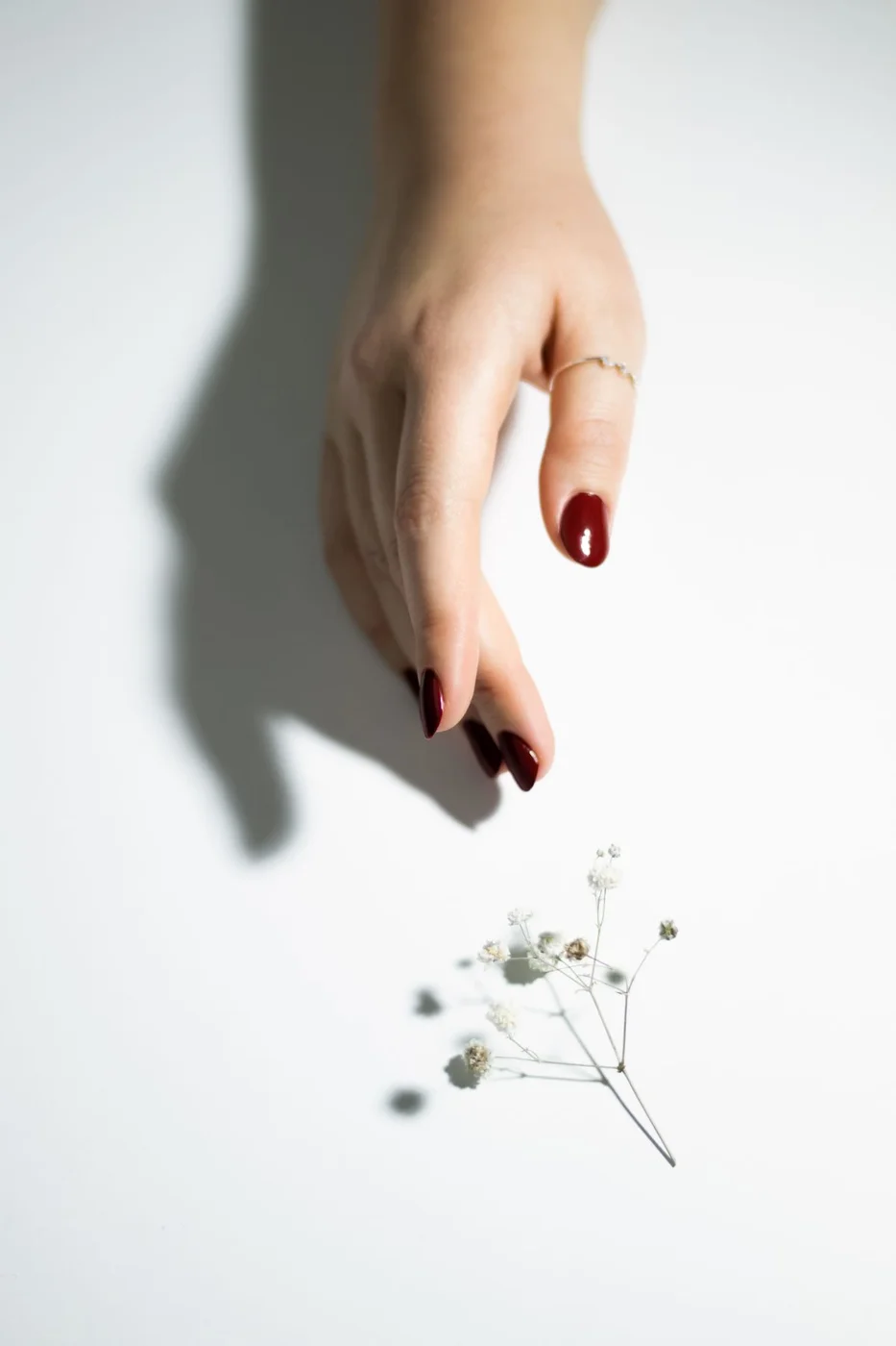
    Red can look cute through its simplicity: one colour, tidy edges and a shape you feel comfortable wearing. A short or medium length keeps the look straightforward. Instead of adding decoration immediately, compare a bright red with a deeper cherry shade. Small changes in undertone can noticeably change the mood.

    The mirrored and floral settings show how a plain red manicure becomes part of an outfit without requiring extra nail art. Keep rings simple if you want the colour to lead. When choosing polish, look at the sample in ordinary light as well as under salon lighting. The right red is the one you enjoy wearing.

    5. Blue nails for a fresh pop of colour

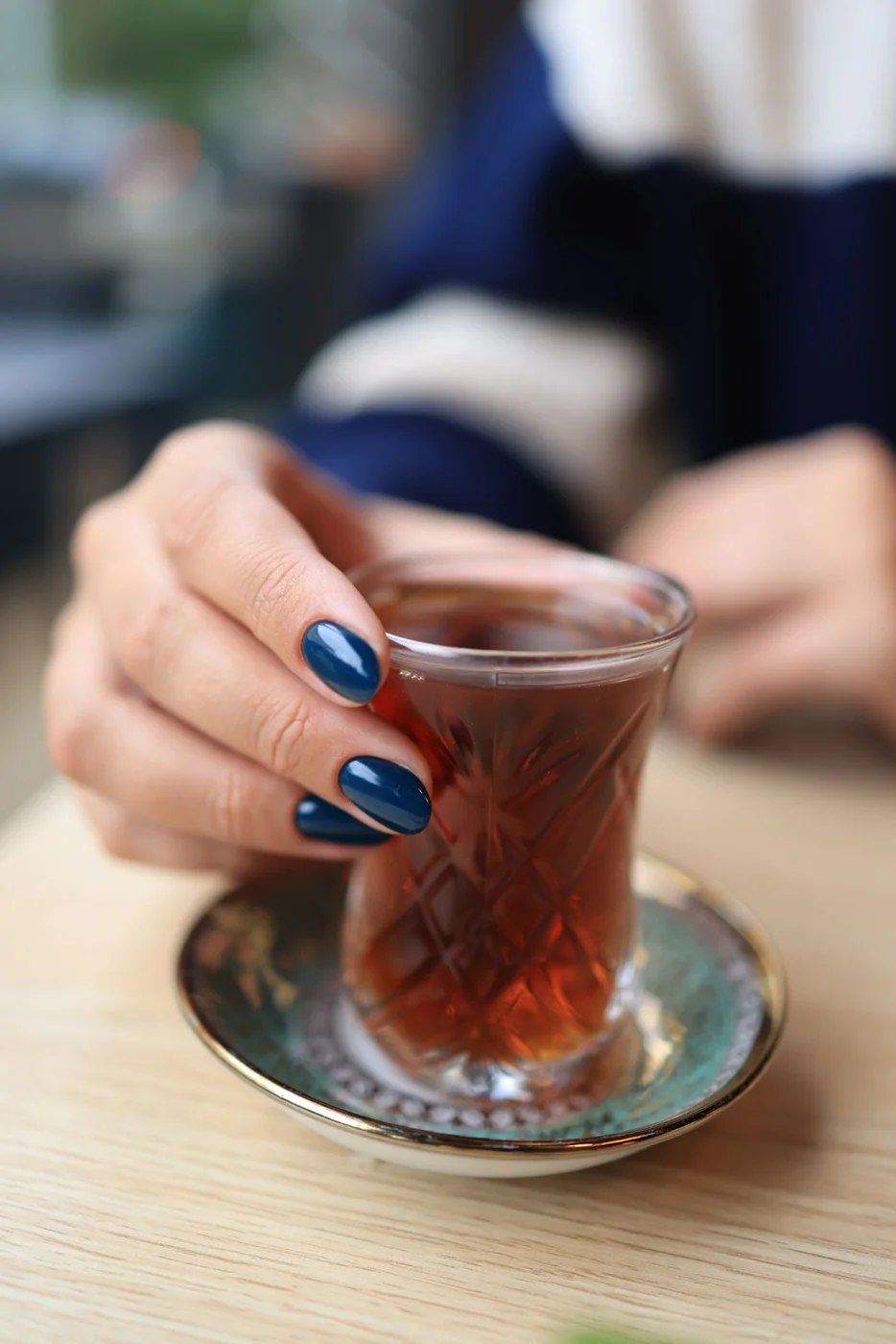
    Blue offers a change from pink while remaining easy to style. A pale shade feels soft, while a stronger blue makes the manicure more noticeable. Keep the surface plain if the colour is already doing enough. This is a good direction when you want something cheerful but do not want a tiny pattern.

    The photographs place blue nails in everyday settings, making it easier to imagine the colour beyond a salon close-up. Choose a length that lets you grip objects comfortably. If you want a gentler result, test the shade on one nail first. A colour that looks delicate online may appear much brighter on your hand.

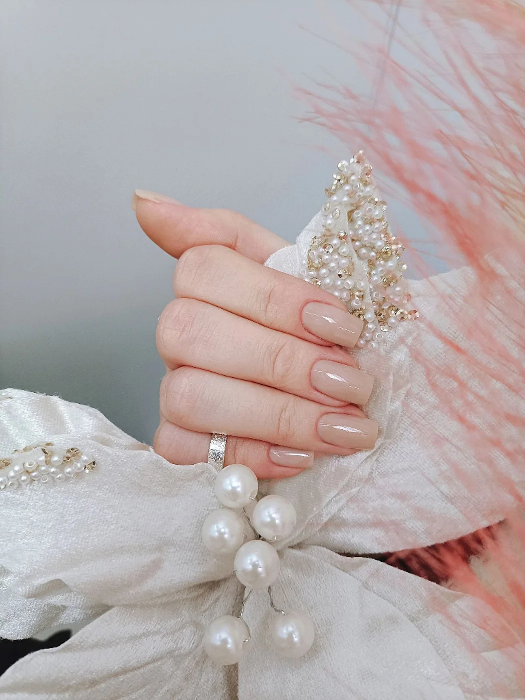
    6. Soft neutral nails

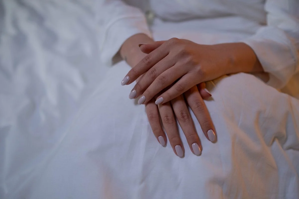
    Neutral nails make a useful pause between louder designs. Think translucent-looking pink, beige or a muted shade close to your preference, rather than a single universal nude. The aim is a finish that feels comfortable and understated. A simple silhouette lets the colour and neat application carry the look.

    These photographs show the manicure in relaxed hand poses, including a pearl accessory. Ask to compare two or three swatches before settling on a shade. If you prefer some detail, add one tiny contrasting dot rather than a whole pattern. Keep expectations realistic: polish changes appearance, but it does not replace attention to nail health.

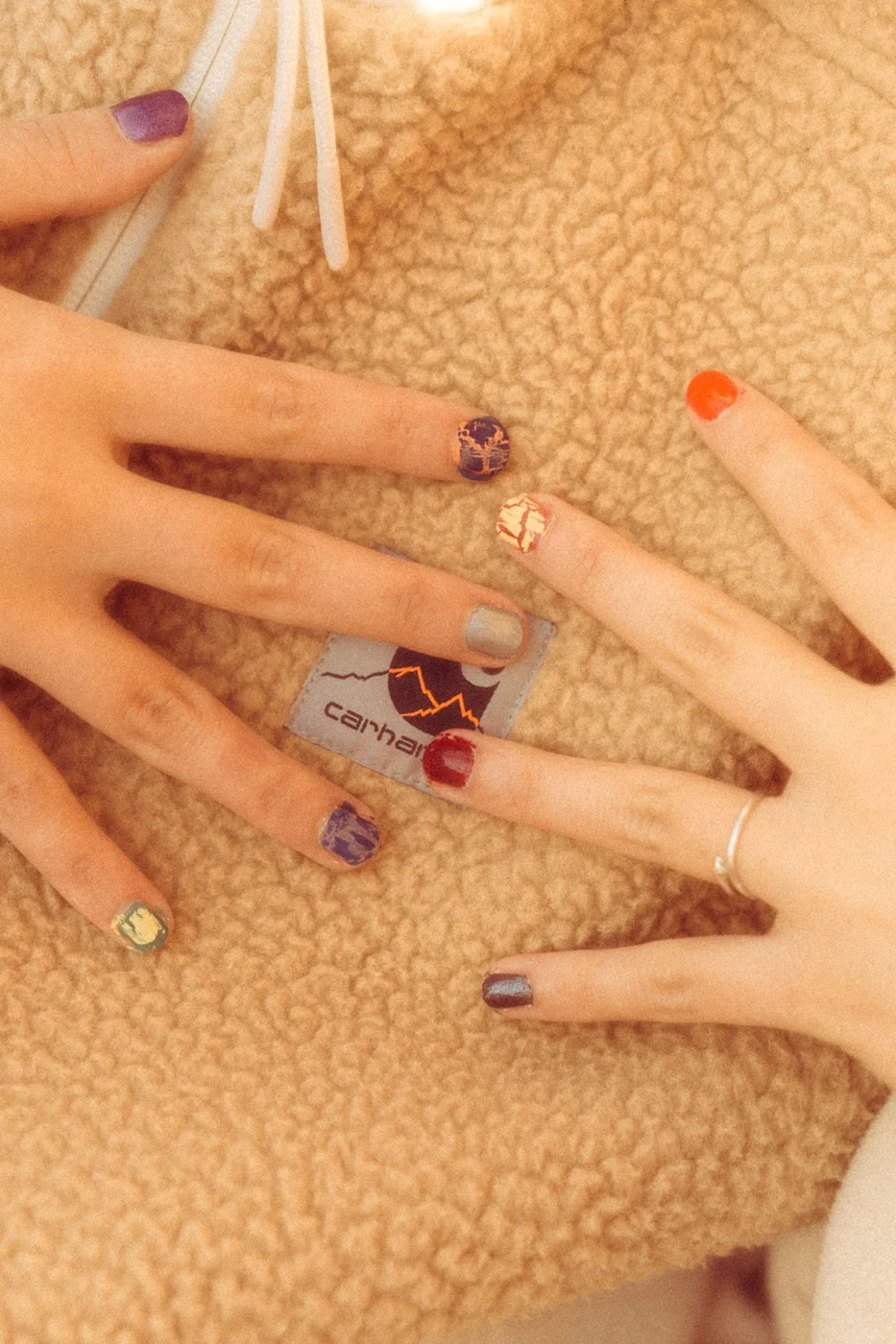
    7. Mix-and-match colour nails

    A different colour on each nail can feel charming when the palette has a clear relationship. You might choose similarly bright shades or group softer tones together. Repeat one colour across both hands to give the set a point of connection. The design should feel playful, not like ten unrelated decisions.

    Use the photographs as permission to experiment with colour rather than a fixed template. Write down your chosen sequence before painting so the second hand feels intentional. If the combination looks too crowded, remove one shade instead of adding another. For sharper pattern inspiration, explore our geometric nail art guide and adapt one simple element.

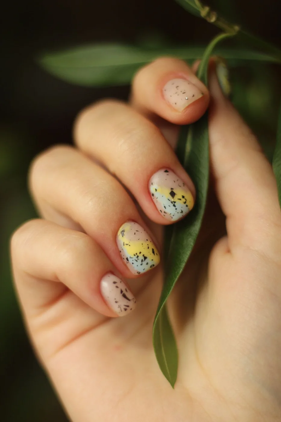
    8. Speckled and patterned accent nails

    Small scattered marks can add character without requiring a perfectly repeated motif. A speckled finish feels different from a small patterned detail, but both work well as accent details beside quieter nails. Keep enough open space around the marks so the design remains easy to read at normal viewing distance.

    The photographs illustrate two directions for this idea rather than the same pattern. Choose the feature you like most: scattered colour or a more decorative detail. Limit your version to a few shades and discuss placement with your artist. Avoid filling every available space just because the reference has a close-up view of the nail.

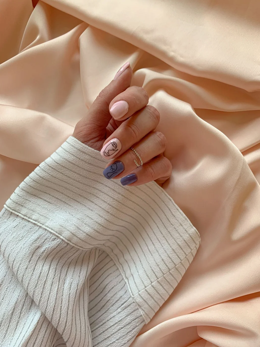
    9. Playful graphic patterns

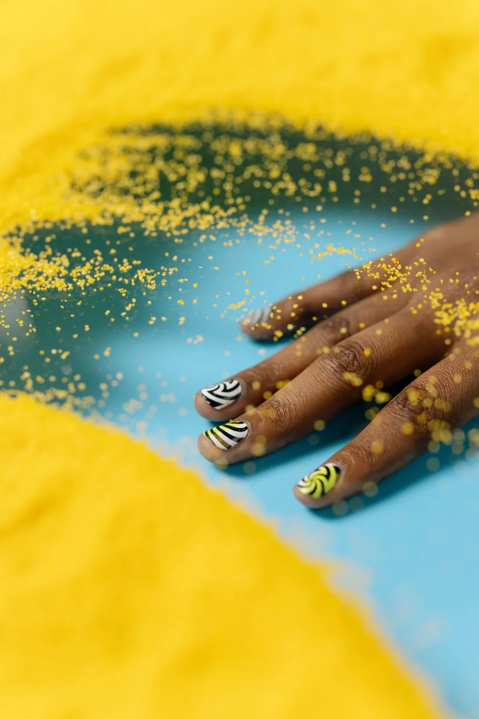
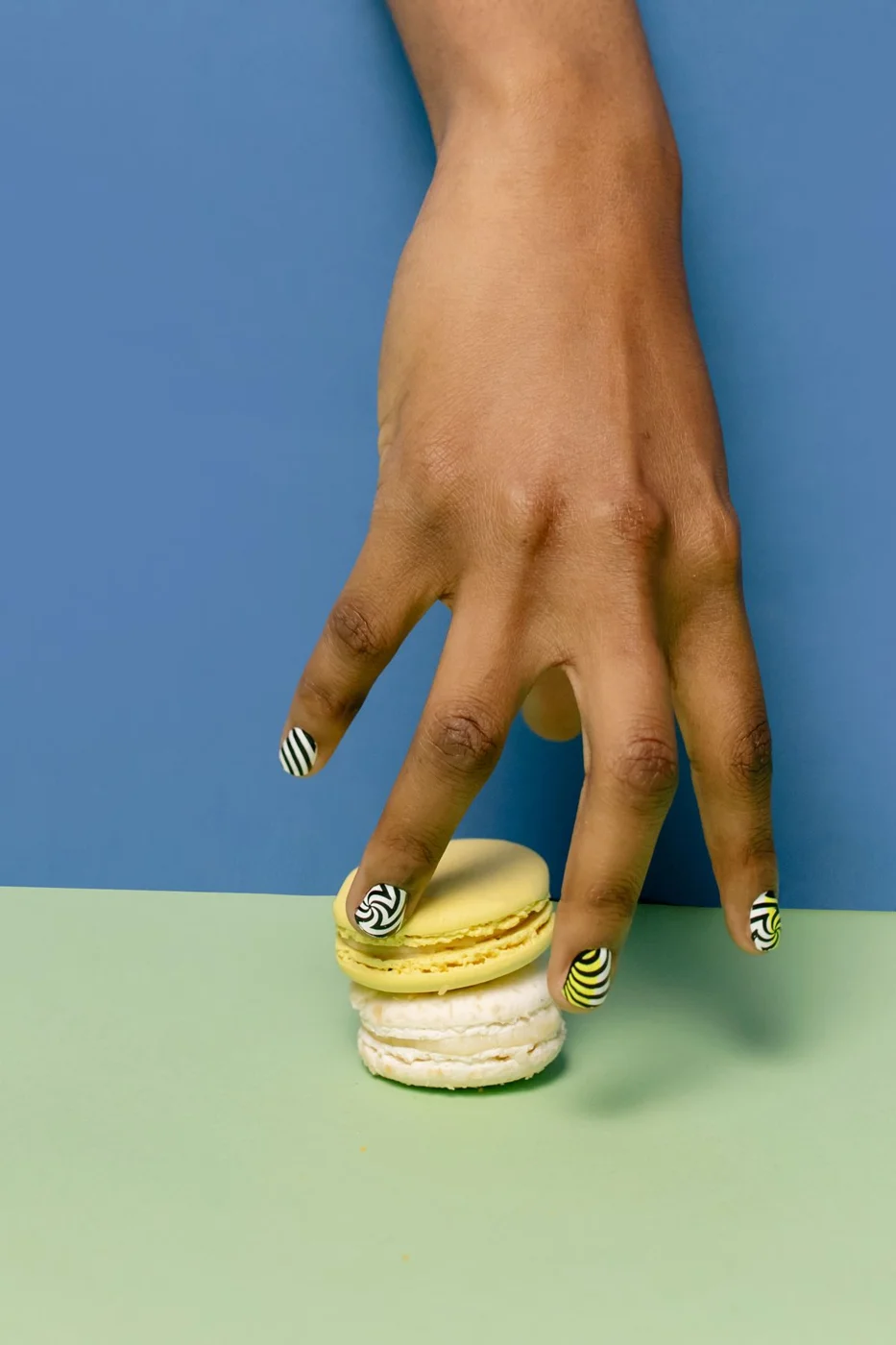
    Graphic nails bring a bolder kind of cute. Stripes, zebra-like marks and curved lines create movement, especially when paired with a plain colour. The two references show patterned manicures with different compositions. You can borrow the contrast while simplifying the pattern to suit shorter nails or a less dramatic style.

    Start with one patterned accent nail and repeat a colour elsewhere in the set. This gives the design a connection without demanding a full patterned manicure. If you prefer a softer theme, our 3D flower nail art guide offers another direction. Choose the detail because you like it, rather than feeling obliged to follow a trend.

    10. Green nails with a fresh finish

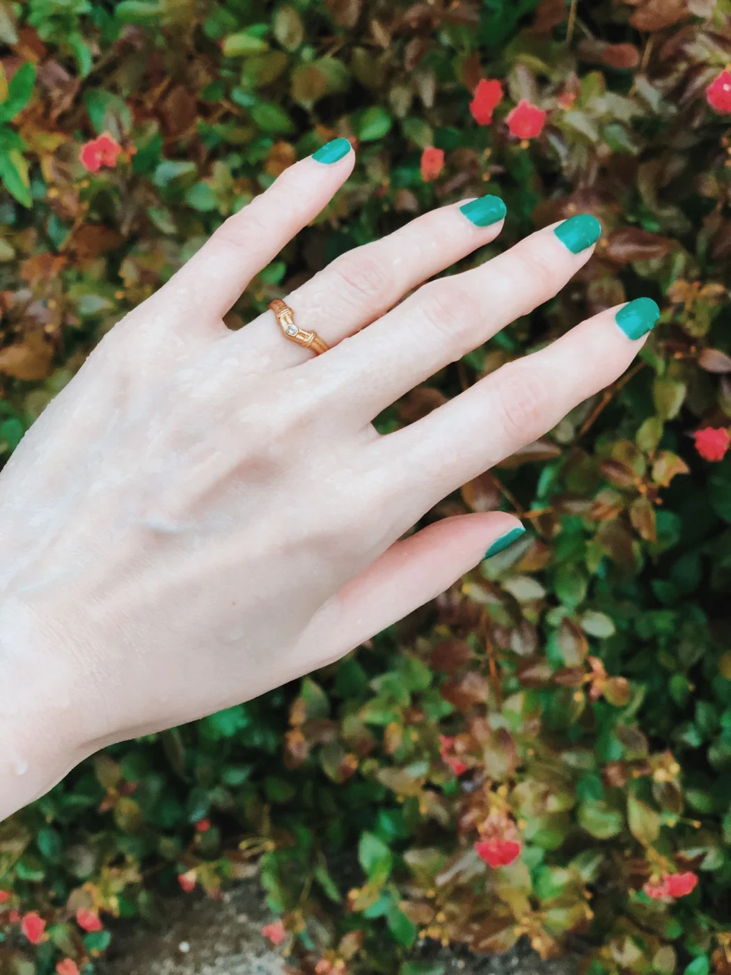
    Green creates a useful alternative to the usual pink and red choices. A lighter shade feels fresh beside pale clothing, while a brighter green has a playful mood. Keep the finish and shape simple when comparing the two. The colour itself provides enough interest for an everyday manicure.

    These photographs show different green-toned looks, so they can help you describe the mood you want without guessing a product name. Check a swatch against your favourite rings and clothing. For a seasonal version, our autumn fall nails guide includes warmer combinations. You can borrow the palette while keeping this manicure uncomplicated.

    Choose a manicure that fits your routine

    Before booking, decide on your maximum comfortable length, preferred shape and amount of decoration. Tell the artist about tasks that matter to you, such as typing or handling small objects. Ask what the quoted service includes and how the chosen finish should be removed. Do not assume a photograph tells you whether a set uses regular polish, gel or extensions.

    For care, the American Academy of Dermatology’s manicure safety guidance recommends moisturising nails after polish removal and avoiding cutting or forcefully pushing back cuticles. Look for a clean salon and properly disinfected equipment. If your nails or surrounding skin are painful, inflamed or otherwise concerning, seek advice from a qualified clinician before another cosmetic service.

    The best cute nail ideas are the ones you can comfortably make your own. Save two references, explain what you like about each and choose a manageable version. A clear colour choice and one thoughtful detail, chosen carefully for your own everyday style, can be enough; you do not need every trend on the same set.

  • Linen Pants: How to Choose, Style and Care for Your Pair

    Linen Pants: How to Choose, Style and Care for Your Pair

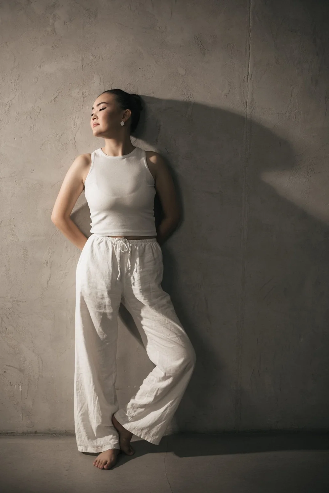
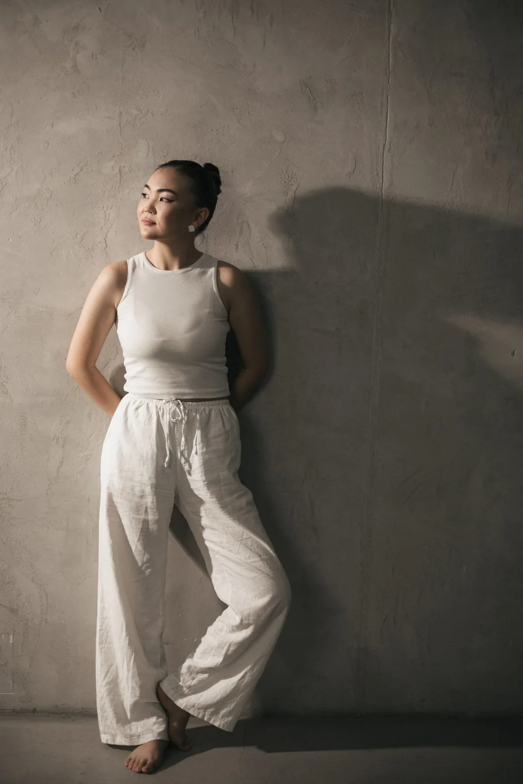
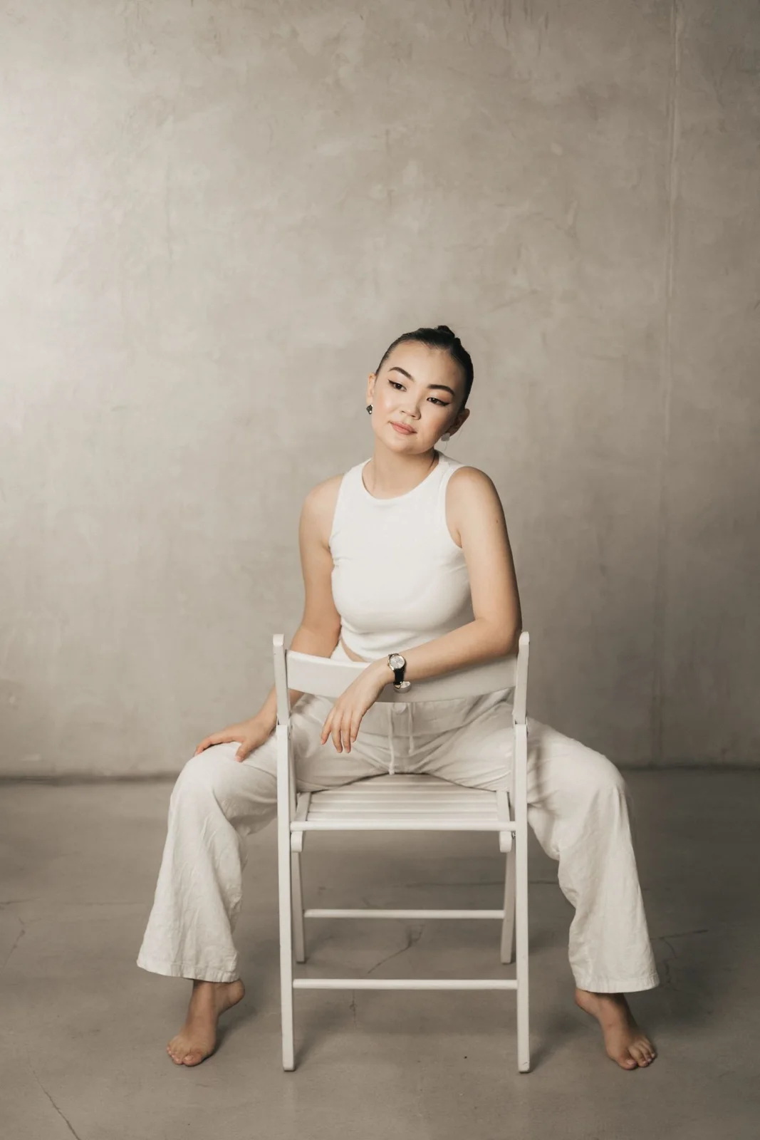
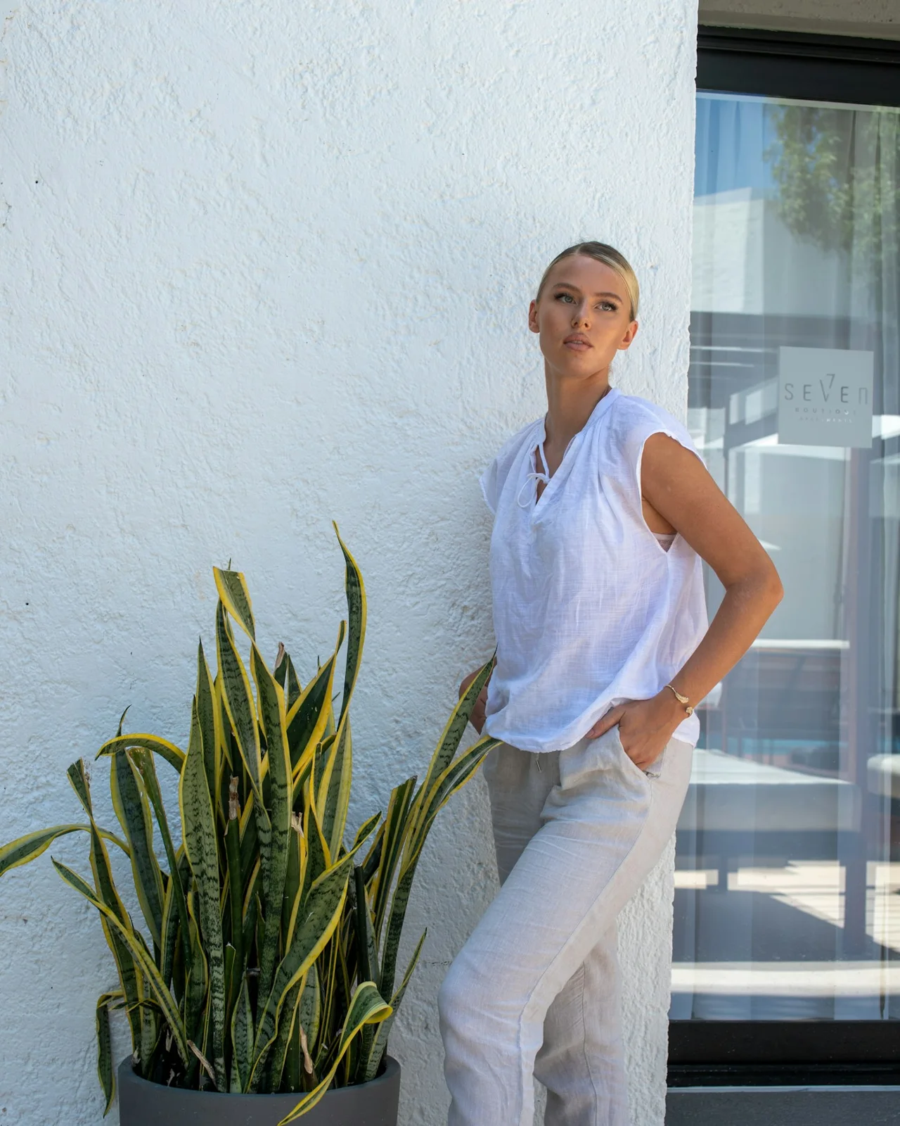
    Linen pants can make getting dressed feel pleasantly uncomplicated. They work with a plain tank, an oversized shirt or a more polished blouse, and their textured surface gives simple outfits character. The trick is choosing a pair that suits your proportions, your shoes and the places you actually go.

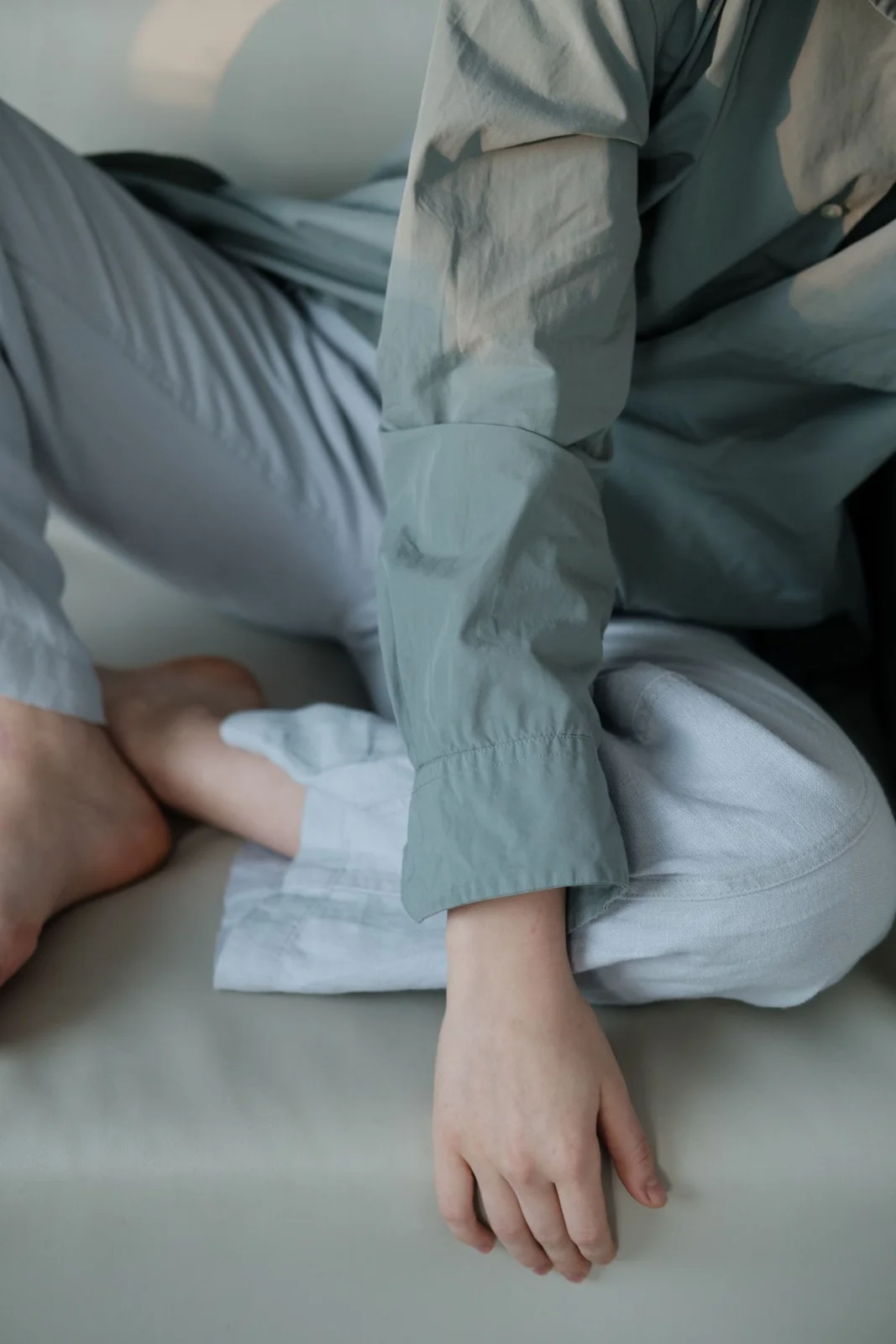
    This guide focuses on practical decisions: fabric composition, fit, coverage, outfit balance and care. The photographs offer styling references rather than proof of a garment’s exact fibre content. Always check the label before buying. You do not need a perfect, wrinkle-free finish to wear linen well; a comfortable fit matters much more.

    Start with the fabric label

    “Linen look” and linen are not interchangeable descriptions. Look for a stated fibre composition instead of relying on a product photograph. A linen blend can behave differently from pure linen, so compare the garment’s weight, lining and washing instructions rather than assuming that a higher percentage automatically makes it the right purchase.

    Hold pale fabric against the light and check the seat, pockets and inner seams. Pocket bags sometimes show through white trousers even when the rest of the fabric looks substantial. If you shop online, look for close-up photographs, a clear returns policy and measurements for the rise and inseam.

    Choose a shape that feels comfortable

    Wide-leg linen pants

    Wide legs create an easy, flowing silhouette. Start with a waistband that stays in place without digging in, then check that the fabric falls from the hips without catching. A fitted tank or a softly tucked shirt helps define the waist without making the whole outfit feel tight.

    Straight-leg linen pants

    Straight legs offer a quieter shape and can be easier to style with shoes you already own. They should skim rather than grip the thigh. If the side seams pull forward or the pockets flare when you stand, try another size or cut instead of covering the problem with a longer top.

    Cropped linen pants

    A cropped hem makes the footwear part of the outfit. Try the trousers with your usual sandals or trainers before deciding on alterations. The best length is the one that looks intentional on your body and stays comfortable when you walk, sit and climb stairs.

    Get the fit right before styling

    Use the fitting room as a movement check. Sit down, bend gently and put your hands into the pockets. A waistband that feels fine while standing may become uncomfortable at a desk. Drawstrings offer adjustment, but they cannot fix a rise that is too short or a seat that pulls.

    Full-length hems should not drag along the ground. If you wear both flats and heels, choose the shoes you expect to use most often before shortening the trousers. Keep the original hem allowance where possible so a tailor has room to adjust the length later.

    Six easy ways to wear linen pants

    1. A white tank and light trousers

    Keep the first outfit straightforward: light trousers, a tank and flat sandals. Add a belt only if the waistband needs definition. Different shades of white can look attractive together; texture often creates enough contrast. Check coverage in daylight, especially with thin fabrics and strong sun behind you.

    2. A relaxed shirt with a partial tuck

    A loose shirt can feel balanced with wide-leg trousers when you tuck in a small section at the front. Leave the sides relaxed rather than pulling the fabric tightly around the waist. Roll the sleeves neatly and keep accessories simple so the outfit feels easy to repeat.

    3. A polished blouse for everyday work

    For a workplace that allows relaxed tailoring, pair straight-leg linen pants with a blouse and closed-toe flats. Choose a waistband and pocket construction that sit smoothly. If your office has a formal dress code, check its expectations first; a casual drawstring style may not meet them.

    4. A tonal outfit for travel

    Build a travel outfit around two similar neutral shades and shoes you can comfortably walk in. Keep a light layer within reach for air-conditioned spaces. Before packing, test whether the trousers stay comfortable through a long seated stretch. Deep, secure pockets are useful, but do not overload them.

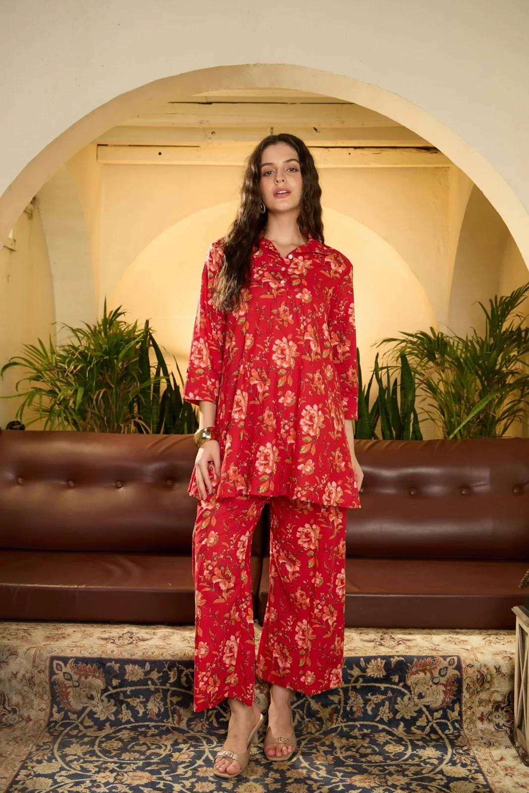
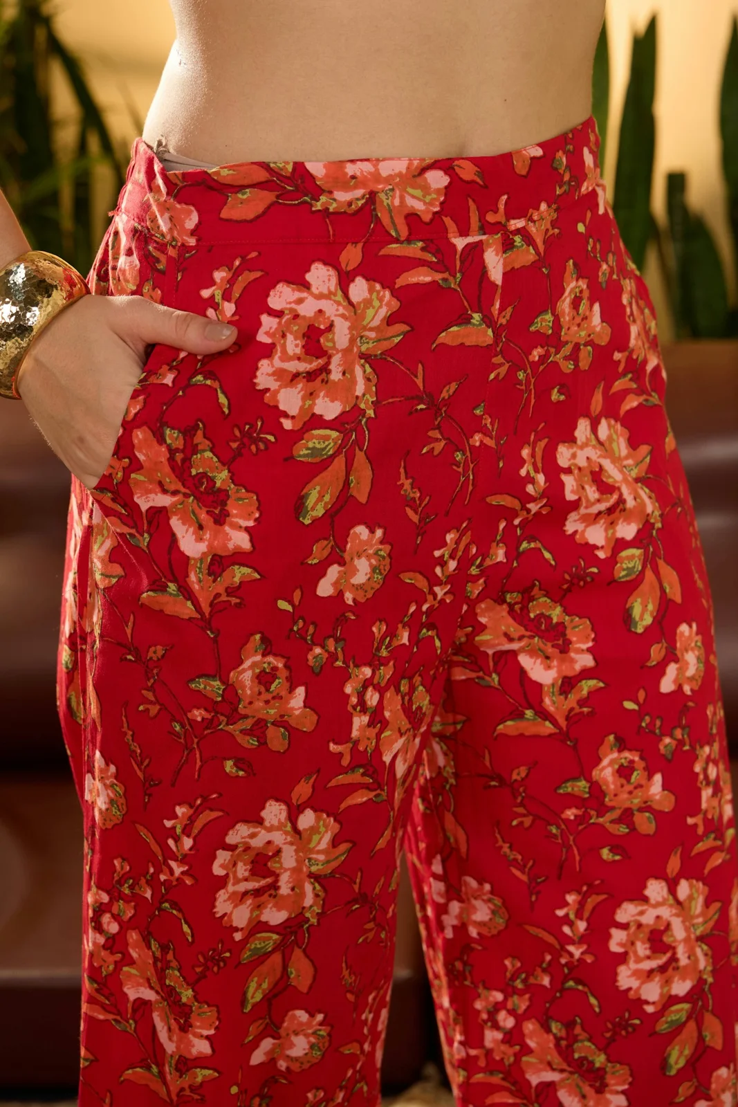
    5. A printed matching set

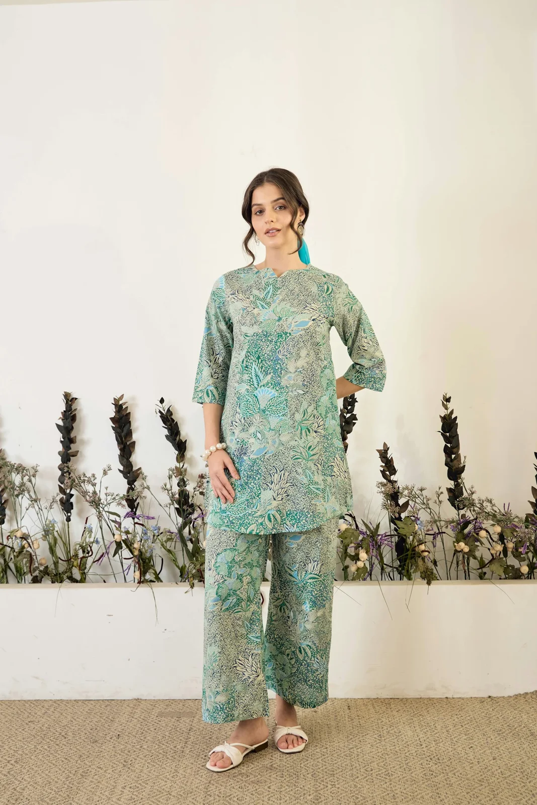
    Printed trousers with a coordinating top can create a complete outfit without extra styling decisions. Choose one colour from the print for your sandals or bag. If the pattern already feels busy, skip a statement necklace. Wear the trousers separately with a plain top to get more combinations.

    6. A soft layer for cooler evenings

    Linen pants need not disappear from your wardrobe at the first cool evening. Add a lightweight knit or cardigan over a simple top. Keep the hem clear of wet pavement and change the footwear to suit the weather. Layering works best when you still have comfortable movement through the waist.

    Pick colours you will actually wear

    White, oatmeal and soft beige are useful starting points, but your existing wardrobe is the better guide. Consider the tops, bags and shoes you already reach for. A darker pair may feel more practical for commuting, while a print can bring interest to otherwise simple outfits.

    If you are reducing unnecessary purchases, our capsule wardrobe guide can help you assess how often a new pair will be worn. Avoid buying three similar colours before you have tried one pair through your normal routine. Repeated outfits are useful information about what works for you.

    Care for linen pants without guesswork

    The care label comes first. The Alliance for European Flax-Linen and Hemp recommends gentle washing for suitable linen garments; construction, trims and linings can change what is appropriate. Use mild detergent, avoid excessive heat and follow the label’s drying instructions. Do not assume every pair is machine washable.

    Hang the trousers neatly after wearing and reshape them while drying. If ironing is permitted, working while the fabric is slightly damp can help. Test the stated heat setting in an inconspicuous area first. Some creasing is part of the appearance; repeatedly using harsh heat to chase every wrinkle is unnecessary.

    Quick questions before you buy

    Will linen pants stretch out?

    Fit can change with wear, and different fabrics and constructions behave differently. Do not size down on a guess. Check the seller’s measurements and reviews, then test the waistband and seat during the return window. A comfortable starting fit gives you a better basis for judging the pair.

    What shoes work with linen pants?

    Sandals, flats and simple trainers are easy starting points. Match the shoe to the hem length and your plans for the day. A shoe that catches the fabric or makes the hem trail is a practical problem even when the combination looks good in a photograph.

    How many pairs do you need?

    Start with one useful pair rather than a collection. Wear it with several existing tops, wash it according to the label and notice which combinations feel natural. Our cardigan and jeans outfits guide offers layering ideas you can adapt, while keeping linen pants as the focus of your outfit.

    Before checkout, confirm the fabric composition, comfortable rise, usable pockets, suitable hem length and care routine you can maintain.

  • Skinny Jeans: A Practical Guide to Fit and Styling

    Skinny Jeans: A Practical Guide to Fit and Styling

    What Are Skinny Jeans?

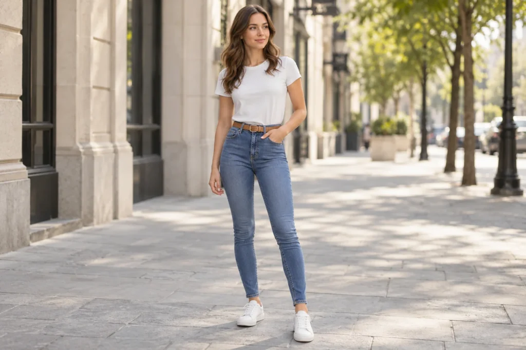
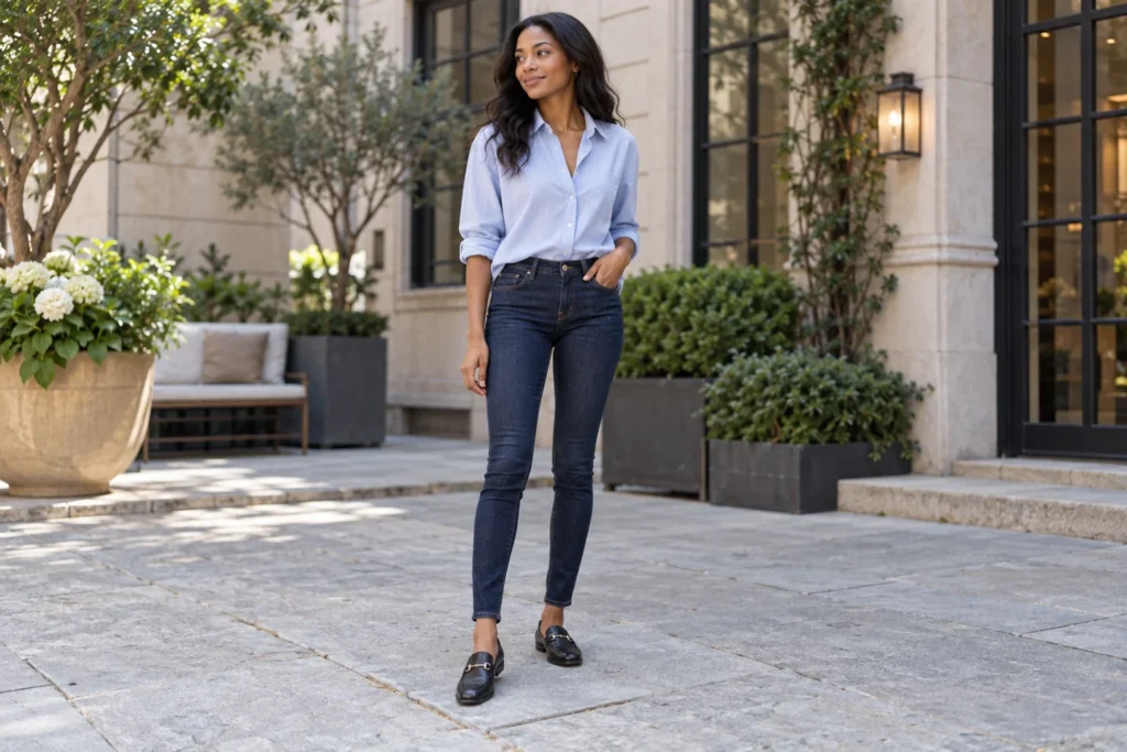
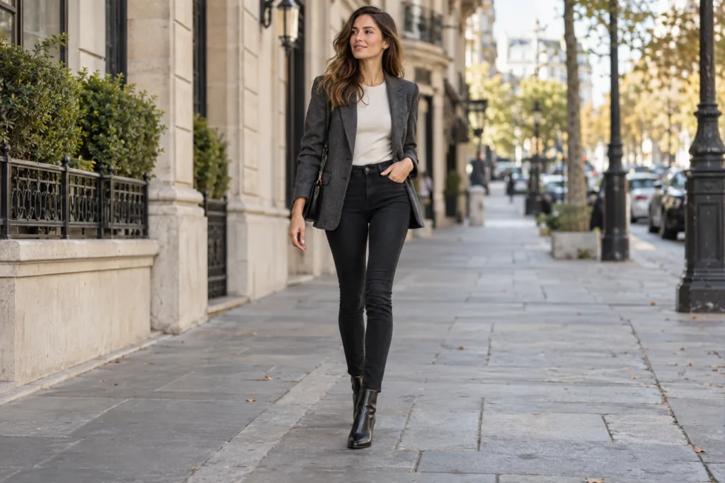
    Skinny jeans follow the shape of your legs from the hips to the ankles. Their close cut creates a clean outline that works with simple T-shirts, soft knits and tailored layers. Getting that outline right starts with comfort: a good pair should feel fitted without making ordinary movement difficult.

    You do not need a completely new wardrobe to wear them well. Start with a wash you like, check the waistband and hem, then build an outfit around the shoes you already own. This guide explains how to choose skinny jeans and style them with practical, repeatable combinations.

    How Skinny Jeans Should Fit

    The waistband should sit securely when you stand, walk and sit. If it gaps at the back while the thighs feel tight, try another cut rather than forcing a smaller size. A contoured waistband or a different rise may suit your proportions better.

    Look at the front pockets and fly. Pockets that pull open or a zip area that strains can suggest the jeans are too tight. At the knees and ankles, a close fit is expected, but heavy bunching usually means the leg length needs adjusting.

    Try These Checks Before Buying

    • Sit down and bend your knees without the waistband digging in.
    • Walk a few steps and check that you are not constantly pulling the jeans up.
    • Make sure the pockets lie reasonably flat and the seams stay straight.
    • Try the jeans with your usual shoes to judge the hem length.

    Choose the Right Rise and Denim

    High-rise skinny jeans can provide a defined waist and work neatly with tucked tops. Mid-rise options may feel more comfortable if you prefer the waistband lower. Neither is automatically more flattering; choose the position that feels right while sitting as well as standing.

    Read the fiber label instead of judging stretch by appearance. Cotton-rich denim can feel structured, while stretch blends allow more give. Try the fabric, then check how it recovers after movement. A soft pair that immediately bags at the knees may not give you the shape you want.

    Pick a Wash You Will Actually Wear

    Dark indigo skinny jeans are an easy starting point for polished outfits. Black creates a simple base for tonal dressing, while medium blue feels relaxed with everyday tops. Light washes show more contrast against dark shoes, so consider the whole outfit before choosing.

    Look beyond the color to the finish. Clean denim is easier to dress up than heavy distressing, and subtle fading can add interest without dominating the look. If you are buying one pair, picture three outfits from your current wardrobe before deciding.

    Before ordering online, compare the listed waist, hip and inseam measurements with a pair you enjoy wearing. Check whether the retailer measures the garment or the body, because those figures are different. Keep the return policy handy until you have tried the jeans with your everyday shoes.

    Five Ways to Style Skinny Jeans

    Each combination below keeps the jeans at the center. The images illustrate styling ideas rather than specific products to buy. Change the colors or layers to suit your wardrobe, but keep the fit and proportions comfortable.

    1. Blue Skinny Jeans with a White T-Shirt

    A white T-shirt and blue skinny jeans make a reliable everyday combination. Choose a T-shirt that skims the body rather than pulling tightly across it. Tuck it fully for a clear waistline, or try a small front tuck if you prefer a more relaxed finish.

    Low-profile sneakers keep the look easy to walk in. Add a simple belt only if it improves the fit or connects with your shoes. Avoid piling on accessories: clean denim, a good neckline and comfortable footwear already give this outfit enough structure.

    Woman wearing blue skinny jeans with a white T-shirt, tan belt and white sneakers

    2. Dark Skinny Jeans with a Button-Down

    Pair dark indigo jeans with a softly relaxed button-down shirt for a tidy daytime outfit. Pale blue, white or a fine stripe keeps the combination uncomplicated. Leave a little room through the shoulders and sleeves so the shirt balances the close-fitting jeans.

    Loafers work well when the hem meets the top of the shoe without bunching. Roll the sleeves lightly and tuck the shirt if you want more definition. For workplaces that allow denim, check the dress code before treating this combination as officewear.

    Woman wearing dark indigo skinny jeans with a pale blue shirt and black loafers

    3. Black Skinny Jeans with a Blazer

    Black skinny jeans provide a clean foundation for an evening outfit with a tailored blazer. An ivory top adds contrast, while a charcoal or black jacket creates a quieter palette. Choose a blazer that hangs comfortably rather than fastening tightly over your hips.

    Ankle boots can keep the outfit streamlined. Check where the hem meets the boot opening: too much denim gathered there can look untidy and feel uncomfortable. A small bag and one simple accessory are enough; let the jacket and dark denim carry the look.

    Woman wearing black skinny jeans with a charcoal blazer and ankle boots

    4. Skinny Jeans with a Sweater and Tall Boots

    A soft sweater brings a relaxed shape to skinny jeans without making the outfit feel oversized everywhere. Oatmeal, grey or cream works easily with medium blue denim. Try a sweater that ends around the hip, then adjust the tuck according to its thickness.

    Tall boots are useful because the narrow jean leg can sit inside the shaft. Smooth the denim before putting the boots on, and check that the calf area does not feel compressed. Choose a comfortable sole and leave enough room to walk naturally.

    Woman wearing blue skinny jeans with an oatmeal sweater and brown knee-high boots

    5. Skinny Jeans with a Cardigan and Flats

    A fine-knit cardigan and dark skinny jeans offer a softer alternative to a jacket. Burgundy, navy or cream can add interest while staying easy to combine. Wear a light top underneath, or button the cardigan comfortably if its neckline and fit allow.

    Ballet flats keep the outfit simple, especially with an ankle-length hem. Check that the shoes feel secure and provide the comfort you need for your day. For more ways to vary the knitwear layer, explore our cardigan and jeans outfit ideas.

    Woman wearing dark blue skinny jeans with a burgundy cardigan and cream ballet flats

    Styling Mistakes Worth Checking

    The most common problem is choosing jeans that look good standing still but feel restrictive in use. Another is an ankle hem that gathers heavily over shoes. Try the outfit in motion, and consider alterations when the waist fits but the length does not.

    Balance is personal, so you do not have to wear something oversized on top. A fitted shirt can work too. The useful question is whether the outfit feels comfortable and intentional. Keep one detail as the focus instead of competing patterns, distressing and bulky accessories.

    How to Care for Skinny Jeans

    Follow the garment’s care label, especially for stretch denim. Different blends and finishes need different treatment, so avoid assuming every pair can handle the same wash temperature or drying method. Turn jeans inside out if the instructions recommend it, and separate colors when required.

    Check stains promptly and avoid unnecessary harsh treatment. If the jeans lose shape, do not automatically use high heat to shrink them; that can change the fit unpredictably. Levi’s denim guidance also emphasizes following garment care instructions for preshrunk jeans.

    Skinny Jeans FAQs

    Can Skinny Jeans Work for Different Body Shapes?

    Yes. Look for a comfortable rise, enough room at the hips and thighs, and a waistband that stays in place. The label size matters less than how the individual cut fits your body.

    What Shoes Look Good with Skinny Jeans?

    Sneakers, loafers, flats and boots can all work. Match the hem length to the shoe opening, and choose footwear that supports the amount of walking you plan to do.

    Make Your Skinny Jeans Easy to Wear

    Choose fit first, then use a few familiar tops and shoes to build outfits you will repeat. When the waistband, denim and hem feel right, skinny jeans become a useful everyday piece rather than something you keep adjusting.

  • Christmas Pajamas: 10 Cozy Looks for the Whole Family

    Christmas Pajamas: 10 Cozy Looks for the Whole Family

    Christmas pajamas turn an ordinary evening at home into part of the celebration. A checked family set, a playful Santa print or a softly draped pair of women’s festive PJs can make decorating, watching a film and opening presents feel a little more special. The best choice also feels comfortable long after the photographs are finished.

    This guide brings together ten Christmas pajama ideas, from family matching Christmas pajamas to kids’ prints and understated adult sets. Each look has two images so you can compare the pattern, shape and styling. The images are styling concepts rather than photographs of products available to buy; use them to decide what to look for in a real garment.

    Choose Your Christmas Pajama Look

    • For a classic family photograph: red-and-green tartan.
    • For playful holiday evenings: candy-cane stripes or Santa prints.
    • For a quieter women’s look: emerald piping, burgundy ribbing or blush stars.
    • For coordination without identical outfits: repeat two or three colors across different sets.

    1. Classic Tartan Family Christmas Pajamas

    Red-and-green tartan is an easy starting point for family Christmas pajamas because the pattern already belongs to the season. A button-up top with a straight trouser creates a traditional adult silhouette, while a cuffed version can give children their own comfortable shape. The sets feel connected without needing every garment to be cut identically.

    Keep the surrounding colors simple. An ivory throw, plain slippers and a few wrapped gifts let the checks remain the focus. If your tree has plenty of colorful ornaments, choose a smaller-scale tartan rather than a very large check so the photograph does not become visually crowded.

    Fit and Styling Tips

    • Compare adult and children’s sizing charts separately.
    • Choose a check that remains visible in a small photograph.
    • Use plain accessories to balance the busy print.

    2. Candy-Cane Striped Matching Pajamas

    Red-and-ivory stripes offer a lighter alternative to tartan. They look festive without relying on character artwork, making them a useful option for couples or a family that prefers graphic patterns. Narrow stripes feel subtle; broader stripes give the outfit a stronger Christmas-morning presence.

    A simple crew-neck top and full-length trousers can keep the look relaxed. Match the warmth of the white across the sets: cream and bright white may look surprisingly different beside one another. For photographs, a neutral background and soft daylight make the stripes easier to read than a room filled with patterned cushions.

    Fit and Styling Tips

    • Repeat the same shade of red across the outfits.
    • Look for comfortable waistbands and cuffs.
    • Keep slippers or socks in a solid color.

    3. Snowflake Kids Christmas Pajamas

    Navy pajamas with small white snowflakes create a winter look that can be worn beyond Christmas Day. The dark ground gives the print definition, while the simple motif works well for children who are less interested in Santa or character designs. A two-piece shape also makes it easy to see whether the sleeves and trouser legs are the right length.

    When choosing kids Christmas pajamas, prioritize the garment’s actual sleepwear labeling and appropriate fit over the photograph. Avoid assuming an oversized lounge set is suitable for sleep. Read the product information, check the child’s measurements and follow the manufacturer’s care instructions rather than buying a larger size solely for extra growing room.

    Fit and Styling Tips

    • Check sleepwear labels and the intended age range.
    • Inspect seams and cuffs for everyday comfort.
    • Choose a print your child will enjoy after the holiday.

    4. Santa Print Christmas Pajamas

    Santa pajamas do not have to be covered in oversized graphics. Small hat, holly or stocking motifs on an ivory background make a cheerful print while keeping the overall outfit easy to wear. This is a good direction when you want an unmistakably Christmas look with a softer color balance.

    Try red piping or a small red cuff to connect the details. If other family members prefer plain pajamas, their sets can echo the same red or ivory. That approach produces coordinated Christmas outfits for photographs without requiring everyone to wear the exact print. Keep extra props minimal so the pattern remains clear.

    Fit and Styling Tips

    • Choose a motif size that suits the garment.
    • Use one print with plain coordinating family sets.
    • Check that buttons and trims feel comfortable against the skin.

    5. Emerald Women’s Festive PJs

    Emerald-green pajamas with ivory piping bring a more dressed-up mood to an evening at home. The contrast outlines the collar, pockets and cuffs, making a simple two-piece set feel considered. A long-sleeve shirt and full-length trousers offer plenty of coverage while leaving room for a relaxed silhouette.

    If you like a satin appearance, inspect the fiber label rather than assuming every glossy fabric is silk. Satin describes a weave, and the feel and care needs depend on the material. Choose a drape you enjoy wearing, then keep jewelry and accessories simple. These women’s festive PJs work particularly well against neutral bedding or a softly lit tree.

    Fit and Styling Tips

    • Check the fiber content and washing requirements.
    • Allow comfortable movement across the shoulders.
    • Balance glossy fabric with simple, matte accessories.

    6. Burgundy Christmas Sleepwear for Women

    Burgundy ribbed pajamas suit someone who wants seasonal color without a busy print. The texture provides interest, while a matching top and trousers create a clean outline. This look can feel festive in December and remain useful through the rest of winter, especially if you prefer a small sleepwear collection.

    Pay attention to how the ribbing stretches at the knees, elbows and waistband. A set that looks smooth while standing should still feel comfortable when you sit down or curl up on the sofa. For more ways to use this rich shade outside the house, explore our burgundy outfit ideas.

    Fit and Styling Tips

    • Compare the fit while sitting and standing.
    • Look for a waistband that stays comfortable without digging in.
    • Choose a consistent burgundy shade for both pieces.

    7. Grinch-Inspired Green Pajamas

    Grinch pajamas bring a playful green-and-red palette to the holiday. A small character print can be easier to coordinate than a large graphic across the entire top, especially when other people prefer calmer designs. Red-and-white cuffs or a plain red pair of slippers can connect the look to more traditional Christmas colors.

    If you want the actual character, look for officially licensed merchandise from a reputable seller and check the product photos and label. Our green illustrated outfit is a styling concept, not a claim that this exact set is available. For a less character-focused alternative, choose green pajamas with small stars and red trim.

    Fit and Styling Tips

    • Check licensing and seller information for character merchandise.
    • Let green be the main color and red the accent.
    • Choose a print placement that remains clear in a family picture.

    8. Fair Isle Family Matching Christmas Pajamas

    Fair Isle-inspired bands combine several holiday colors in one repeating design. Navy, red and ivory can feel more restrained than an all-red set, while the patterned rows create an obvious link between different family outfits. It is a useful option when you want matching Christmas pajamas with a winter rather than a cartoon theme.

    Do not judge the fabric by the pattern alone: a knitted-looking print may be printed on a completely different material. Check the composition and feel before buying. If matching sizes are unavailable, one person can wear a plain navy top with coordinating patterned trousers. The repeated palette still makes the group look intentional.

    Fit and Styling Tips

    • Check fabric information rather than relying on the printed texture.
    • Keep the same three colors across the family.
    • Use a plain coordinating piece when an identical set is unavailable.

    9. Blush Pink Festive Pajamas

    Blush pink pajamas with tiny burgundy stars offer a gentler interpretation of Christmas sleepwear. The print feels festive without depending on the usual red-and-green combination. A piped collar and full-length trousers can make the set feel polished enough for Christmas-morning photographs while keeping the mood relaxed.

    Pair the look with ivory surroundings or a small burgundy detail rather than adding more pink everywhere. If you are shopping for Christmas sleepwear for women, compare the rise of the trousers, sleeve length and button spacing as well as the color. An attractive pattern will not make up for a shirt that pulls when you move.

    Fit and Styling Tips

    • Choose small motifs for a subtle holiday finish.
    • Check button spacing and sleeve length.
    • Repeat burgundy in one accessory or surrounding detail.

    10. Coordinated Mix-and-Match Christmas Pajamas

    Matching does not always mean identical. Ivory tops with forest-green or burgundy checked trousers can bring several preferences together in one family photograph. This approach is especially helpful when different ages need different cuts, or one person dislikes an all-over print.

    Start with a shared base color, then choose one or two accents. Keep the pattern scale similar and avoid mixing too many unrelated motifs. The same principle works when planning daytime Christmas outfits: repeat a color rather than copying every piece. Our capsule wardrobe guide explains how a small, connected palette makes outfit combinations easier.

    Fit and Styling Tips

    • Choose one base color and no more than two accents.
    • Let each person keep the cut they find comfortable.
    • Use similar print scales to tie different sets together.

    How to Choose Comfortable Christmas Pajamas

    Begin with the occasion. Pajamas for a quick photograph, a long evening on the sofa and a full night’s sleep may need different priorities. Consider room temperature, the feel of the seams and how the waistband behaves when you sit down. Check the fabric composition, size chart, return terms and care label before ordering.

    For children, follow local sleepwear requirements and the garment’s labels. In the United States, the CPSC’s children’s sleepwear guidance explains why the correct fit and labeling matter; oversized cotton clothing should not be treated as a substitute for suitable children’s sleepwear. Keep comfort and suitability ahead of matching the adults exactly.

    Care and Christmas-Morning Styling

    Wash according to the care label rather than treating every Christmas set alike. Separate strong colors when advised, fasten closures if the label recommends it and avoid heat settings the fabric cannot tolerate. A gentle-looking fabric can still have specific requirements. Check whether a new set needs washing before first wear.

    Put the outfits on and test the fit before the day you want to photograph them. Use window light, keep the background simple and give everyone room to move naturally. For daytime plans after the pajamas come off, our cardigan and jeans outfit ideas offer an easy next layer of inspiration.

    Christmas Pajamas FAQs

    What are the best Christmas pajamas for a family photo?

    Choose a coordinated palette and a pattern that remains clear from a distance. Tartan, stripes and Fair Isle-inspired designs are useful starting points, but comfortable fits and everyone’s preferences matter more than perfect matching.

    Do family Christmas pajamas have to be identical?

    No. Repeat a base color and one or two accents across different tops and trousers. This can be easier when adults and children need different cuts or when some family members prefer plain pieces.

    How should kids Christmas pajamas fit?

    Follow the sleepwear label, local requirements and the manufacturer’s measurements. Do not automatically size up for an oversized look. If you are unsure whether a garment is intended for sleeping, ask the seller before using it as sleepwear.

    Can women’s festive PJs be worn after Christmas?

    Yes. Solid emerald, burgundy, small stars and simple stripes can feel seasonal without being limited to one morning. Choose a color and fabric you would enjoy wearing throughout winter.

    Make the Look Your Own

    The right Christmas pajamas balance a festive look with a fit you actually enjoy wearing. Start with one palette, decide how closely the family wants to match and check the labels before choosing a set. Whether you prefer Santa prints, playful green designs or understated women’s sleepwear, a few thoughtful details can make the holiday feel special without making the outfit complicated.